Web and currency calculator for global payment platform
Role and timeline
• Product designer • August 2020 - September 2020
Methods or tools
User Journey Mapping / Competitive Analysis / Visual design / prototyping / testing
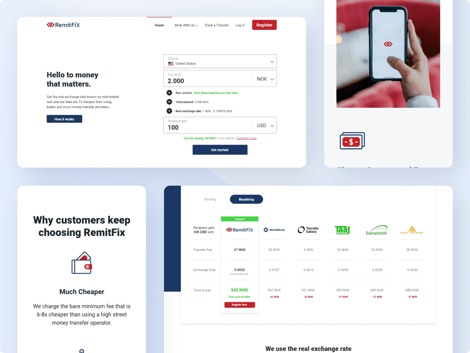
In August 2020, I was contacted by Remitfix, a startup with a mission to make sending money as easy as sending a text message. They had been developing a platform and were now looking to launch. They were seeking a designer to create a website with the primary function of allowing users to send money through it.
The Challenge
Problem
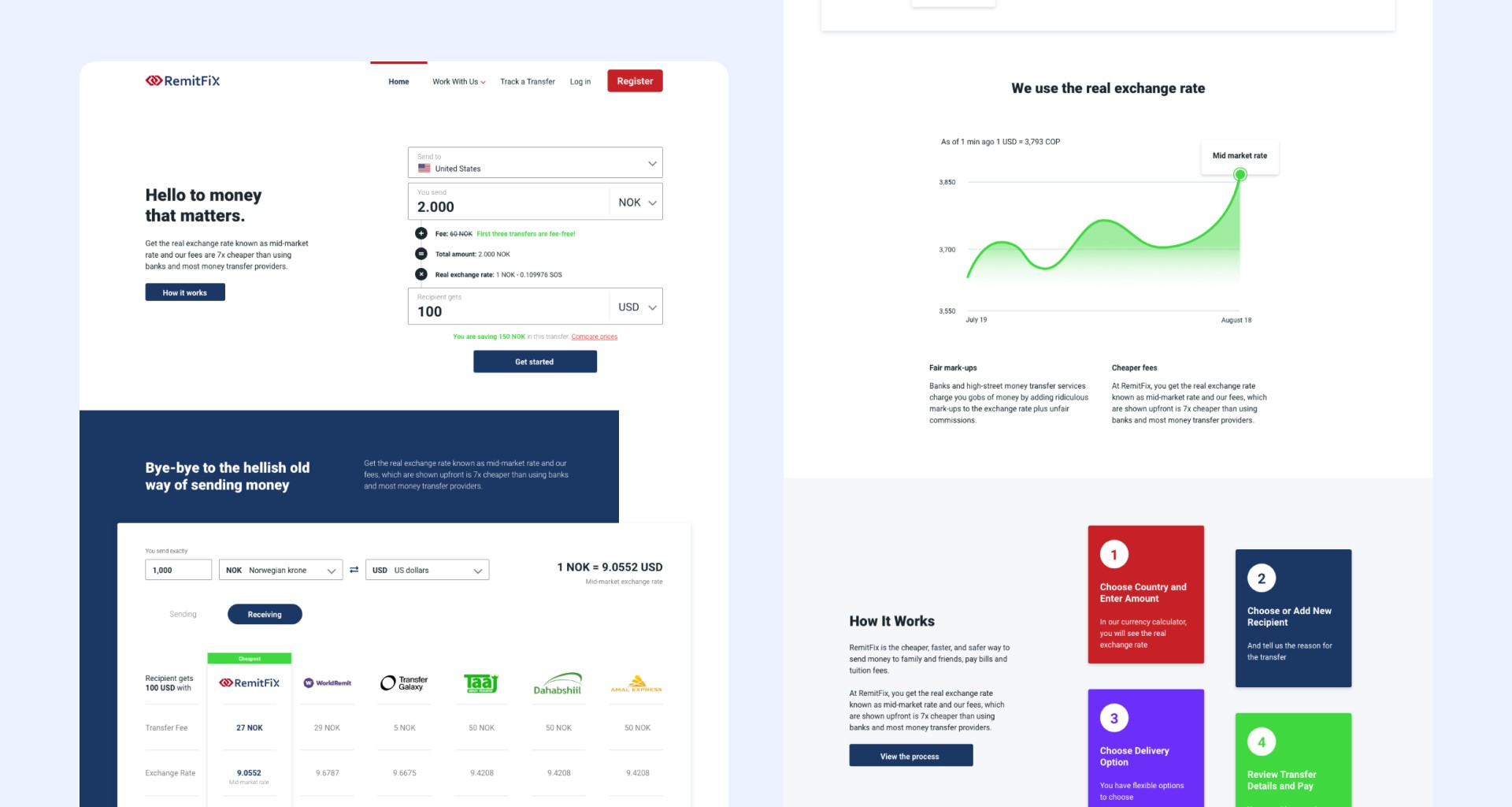
Users face issues with the amount of time it takes to send money, especially because they have to check multiple websites to find the one with the lowest fees so they can send the maximum amount.
Hypothesis
Taking these issues into consideration, my aim is to create a web experience that functions more like a tool, simplifying the research process for the user with user-friendly features and informative results. By doing so, users can quickly access the information they need to choose a money sender platform.
Research
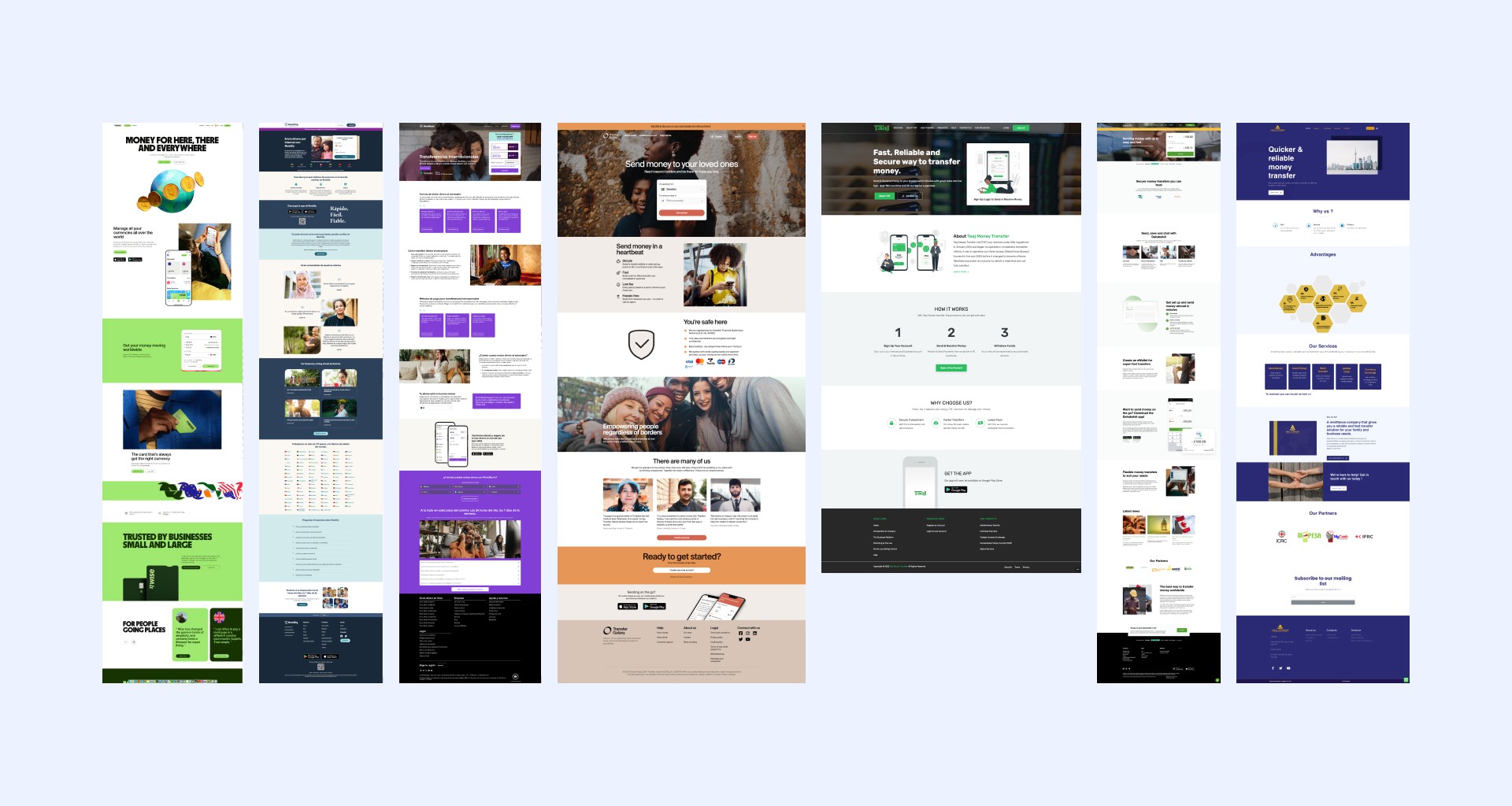
Competitive analysis
To identify potential areas for improvement, I conducted a competitive analysis of 10 prominent money sender websites before beginning the design phase. I took screenshots and noted common features to observe how competitors solve similar problems. Additionally, by interacting with the websites, I evaluated potential areas for improvement.
System story
Based on the insights gained from competitive analysis, the following system story has been created to establish the initial requirements of the project.
What?
A website for sending money.
Who?
For expats residing in Norway.
Why?
To help them quickly and inexpensively send money to their families in their home country.
How?
By providing excellent search capabilities, service comparison information, and a fast money transfer experience.
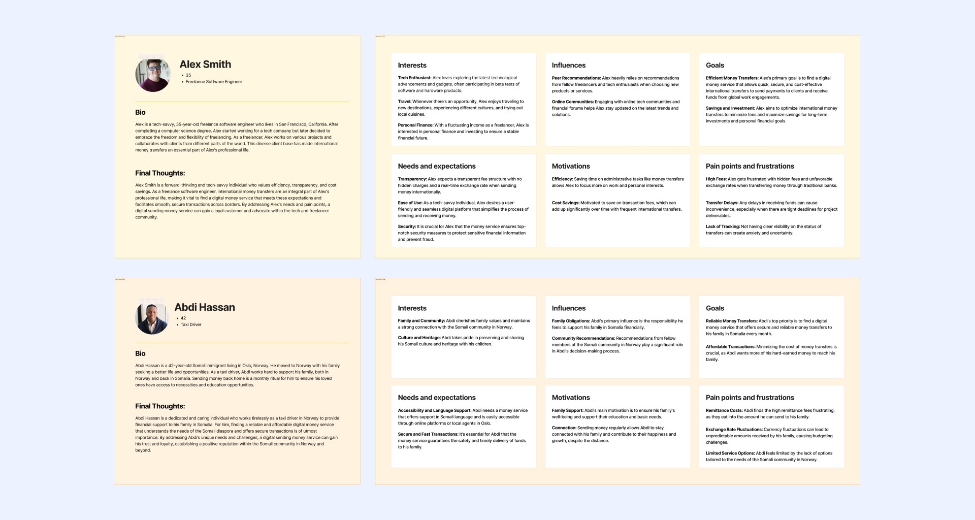
Personas
With a defined user story, I’ve captured different frustrations and goals for expats sending money to their families. The personas helped me ensure every feature and information I design was done with the user in mind.
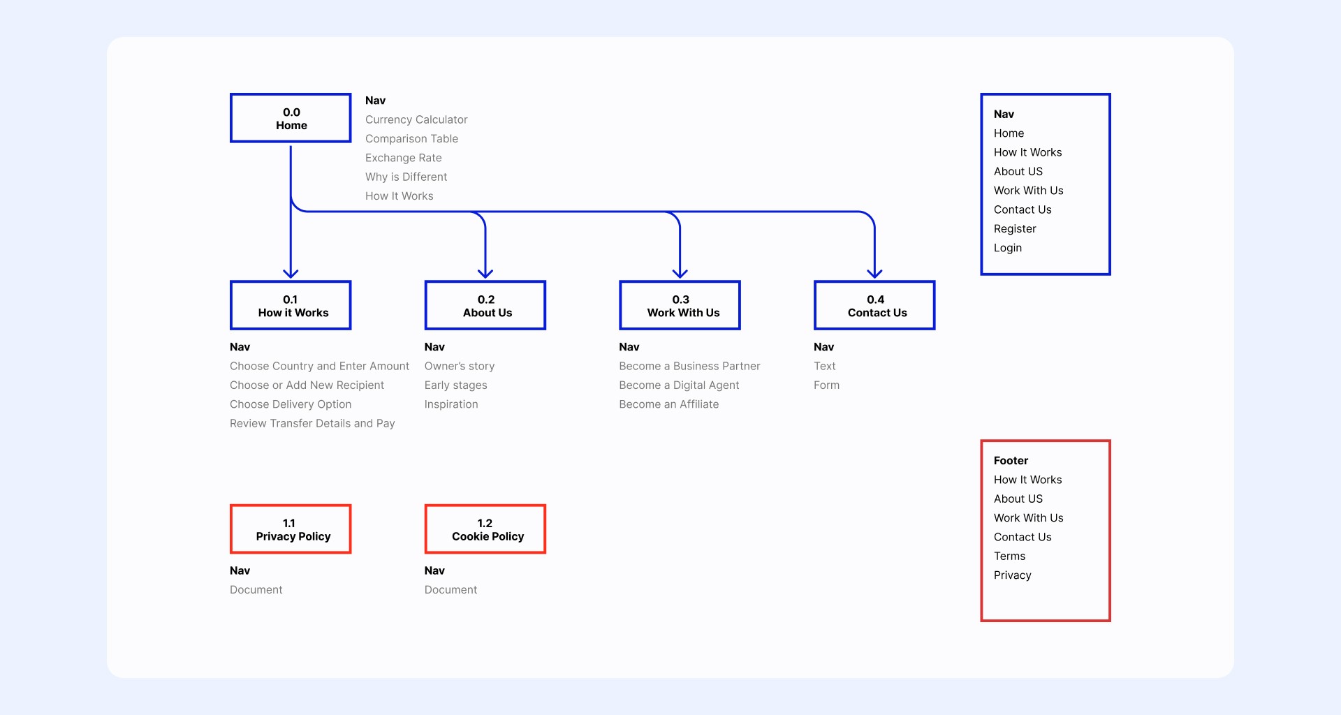
Sitemap
To ensure that everyone was on board, I constructed the website's sitemap with the information architecture. To take a user-centric approach and validate defined problems and hypotheses, I based the sitemap on the personas and competitive analysis.
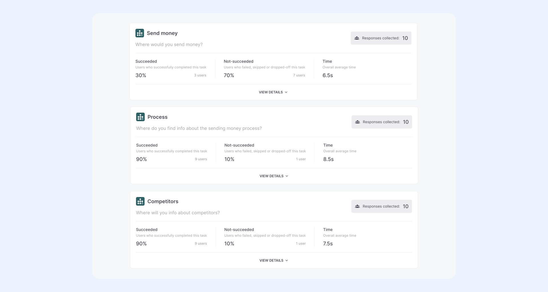
Tree testing
After constructing the sitemap, I conducted a tree testing session with 10 foreign testers who matched the user persona in some way. The acceptance criteria was that they had sent money abroad before using an online service, which allowed us to receive accurate feedback and make improvements.
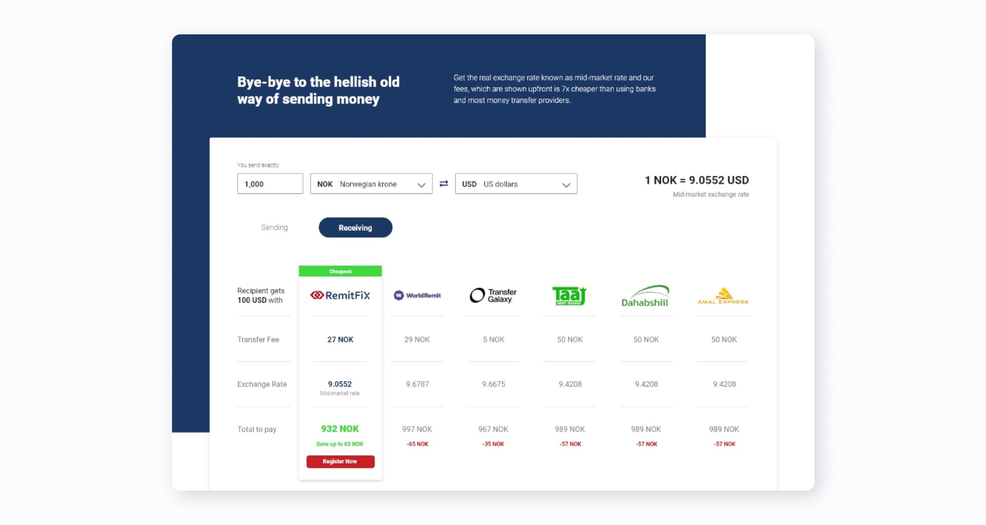
From the tree testing, we identified some opportunities for improvement, including:
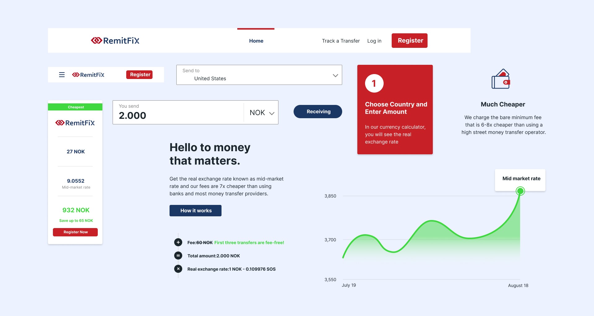
Prioritizing the currency calculator as the first item on the page.
Moving the comparison section to a secondary position.
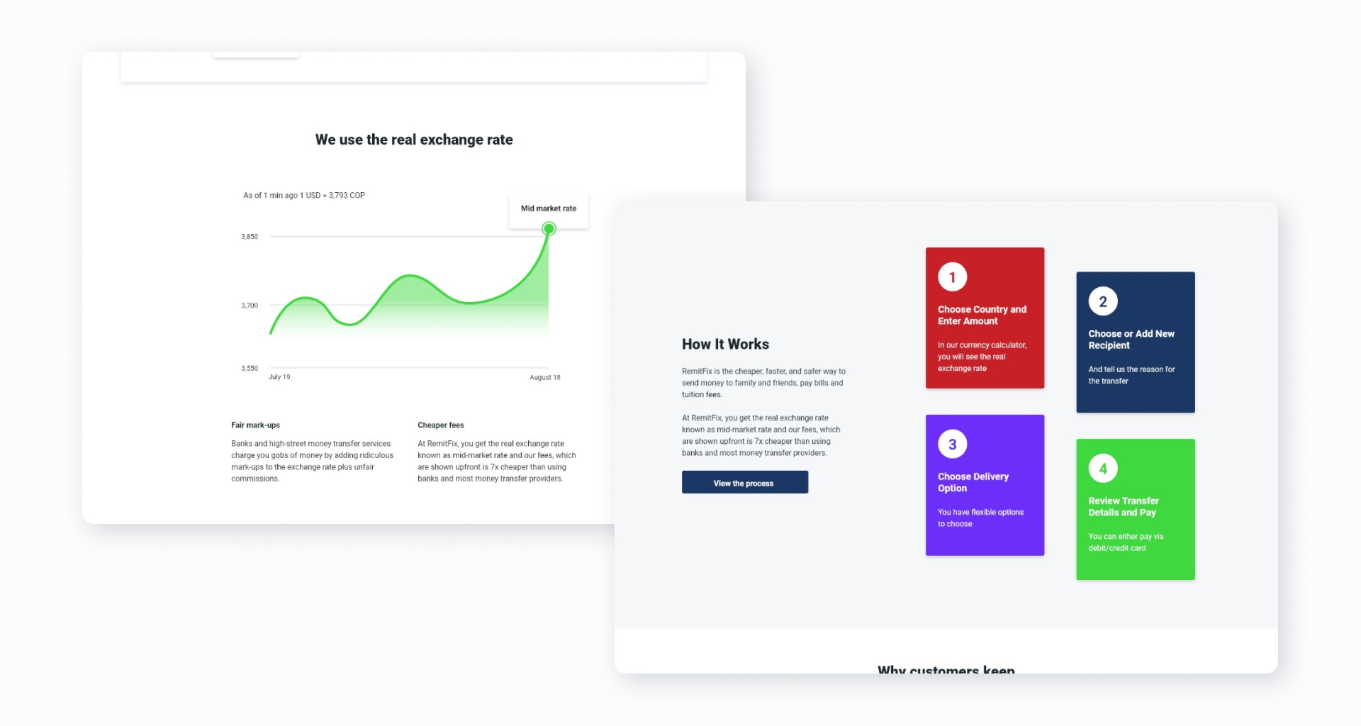
Highlighting the real exchange rate section as a valuable feature.
Adding a "Track a Transfer" button, which is present in other similar services.
Design
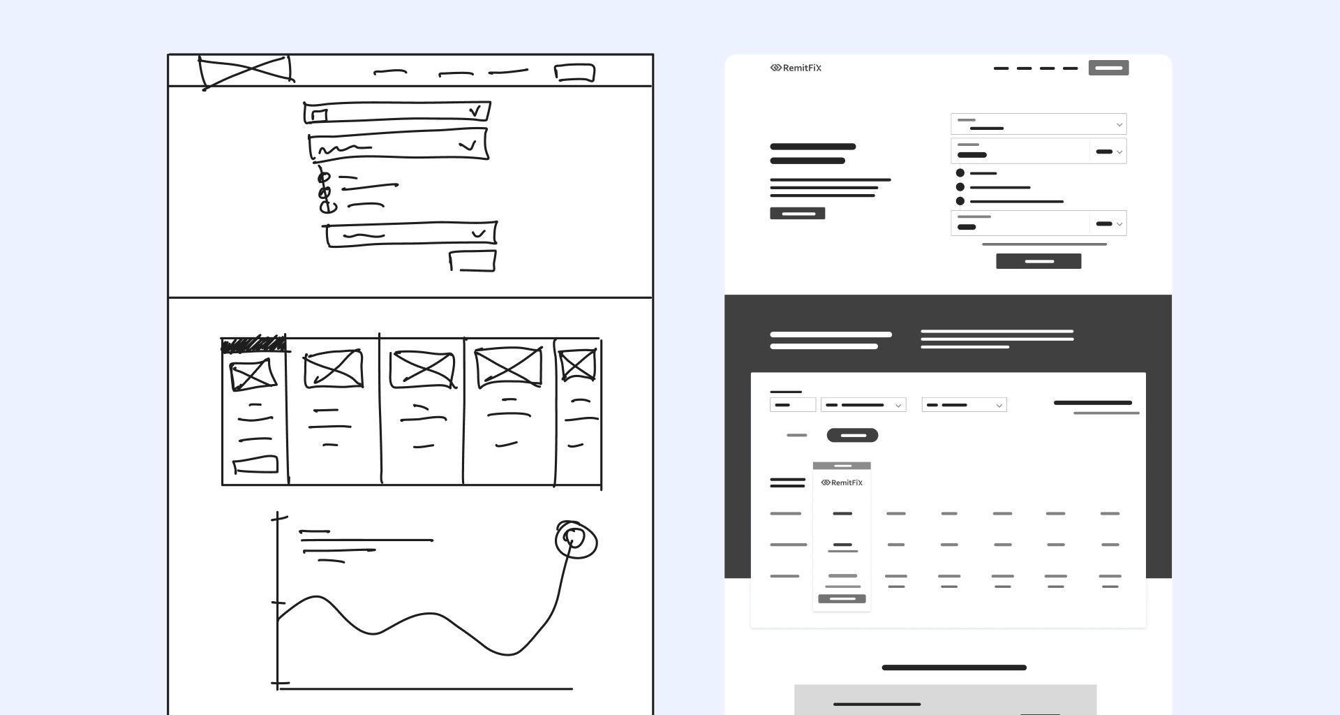
Sketching and wireframing
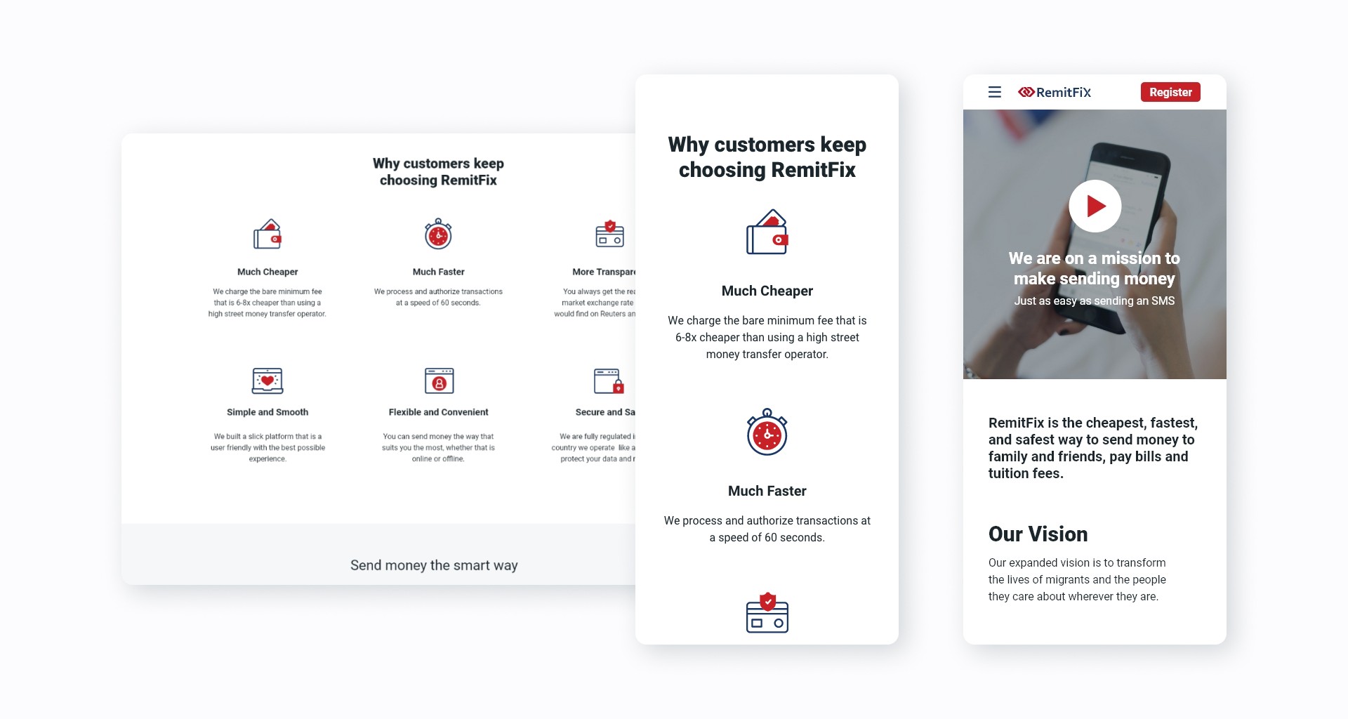
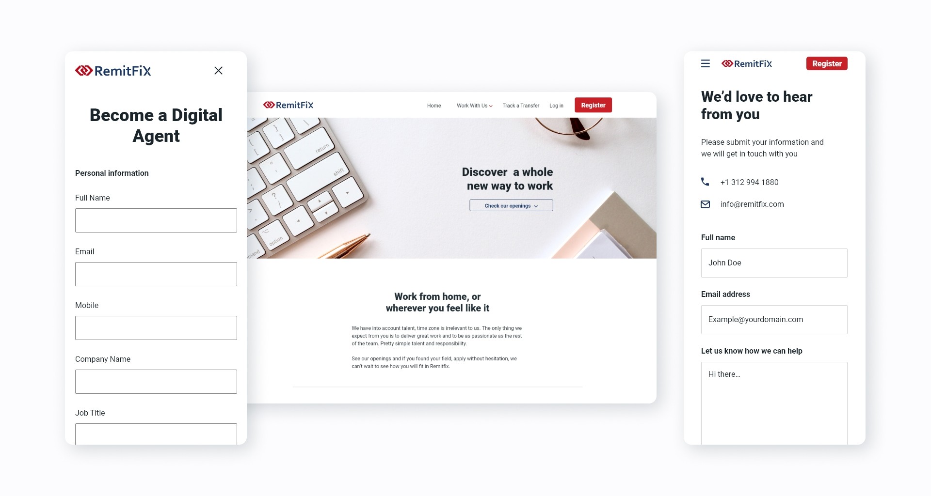
After validating the overall structure of the website, I began by sketching the different screens on paper. Once I had a good idea of where the main components would be placed, I digitized the paper sketches into wireframes using Figma to refine the design layout. This step allowed me to determine the necessary functionality and content. After several iterations on the wireframes, I created a high-fidelity mockup of the landing page by adding content, photos, colors, and typography.
Style guide
To achieve a consistent and cohesive style for the website and align it with the platform, I created a style guide using the Atomic design approach for design systems. This approach ensures that the style will be scalable in the future. To start, I created the atoms or building blocks for the style guide, which include:
Typography
Colors
Iconography
Buttons
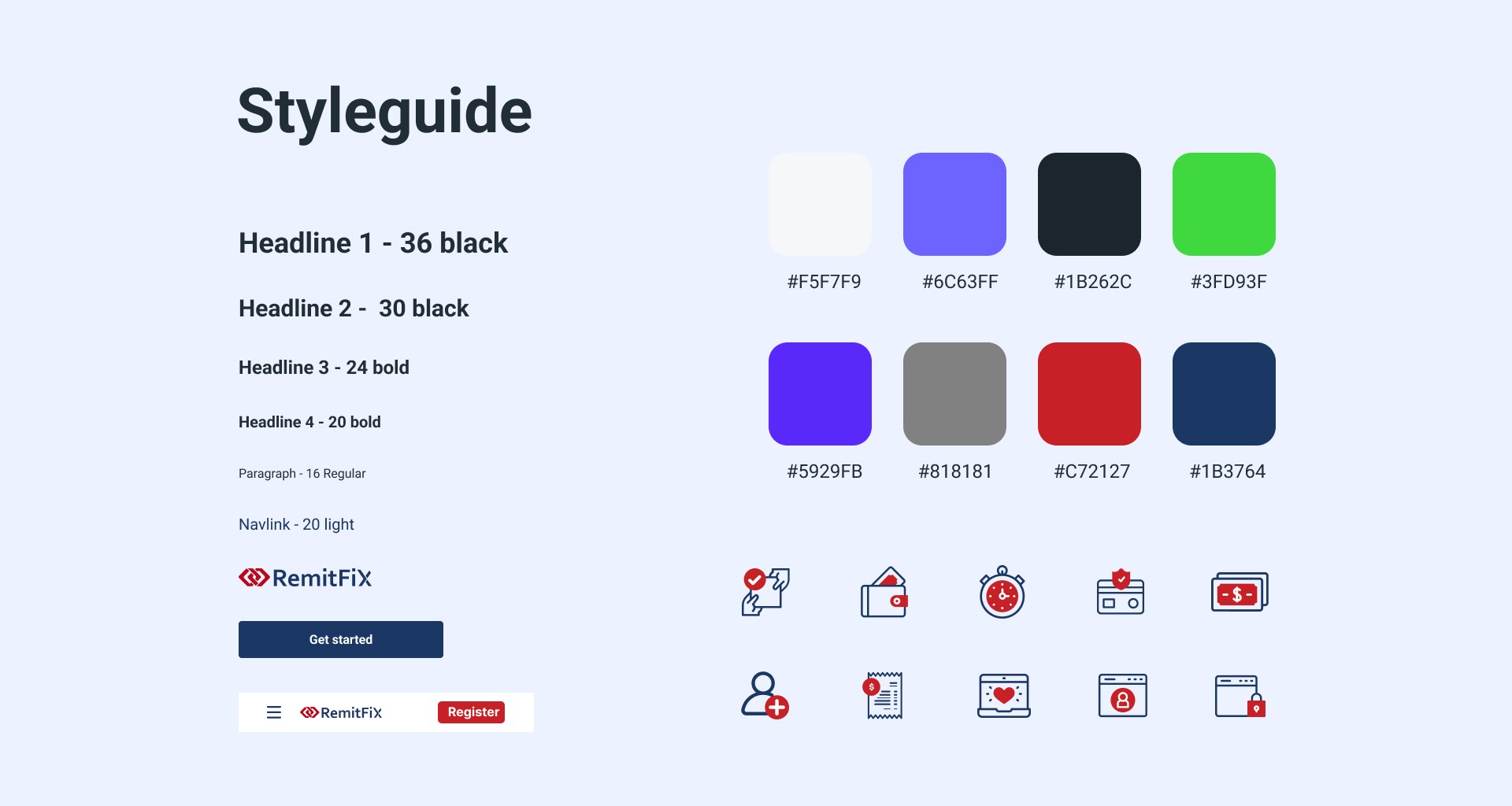
Then, by combining atoms, I created molecules and components to ensure consistency throughout the entire website. This approach also allowed me to create base components that are used across the experience, thus making it easier to maintain the system without spending too much time changing hundreds of screens. Some of these molecules or components include:
Field inputs
Lists
Navigation items
Info boxes
FAQ rows
Opening rows
Cards
Dropdowns
Switches
Afterward, the final step was to create templates or sections on each page, as well as the remaining screens for the entire website. This atomic approach allowed me to make fast iterations and changes that were crucial to delivering the project on time.
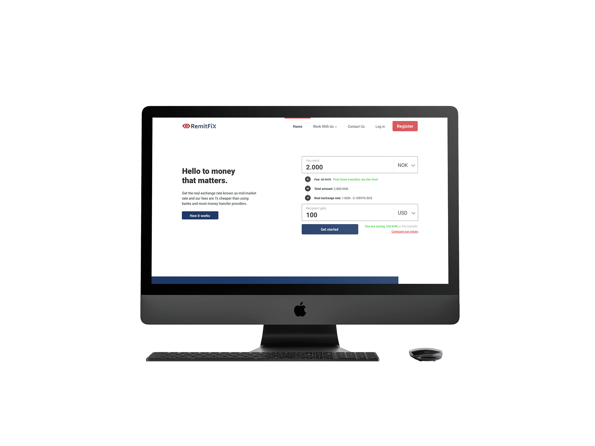
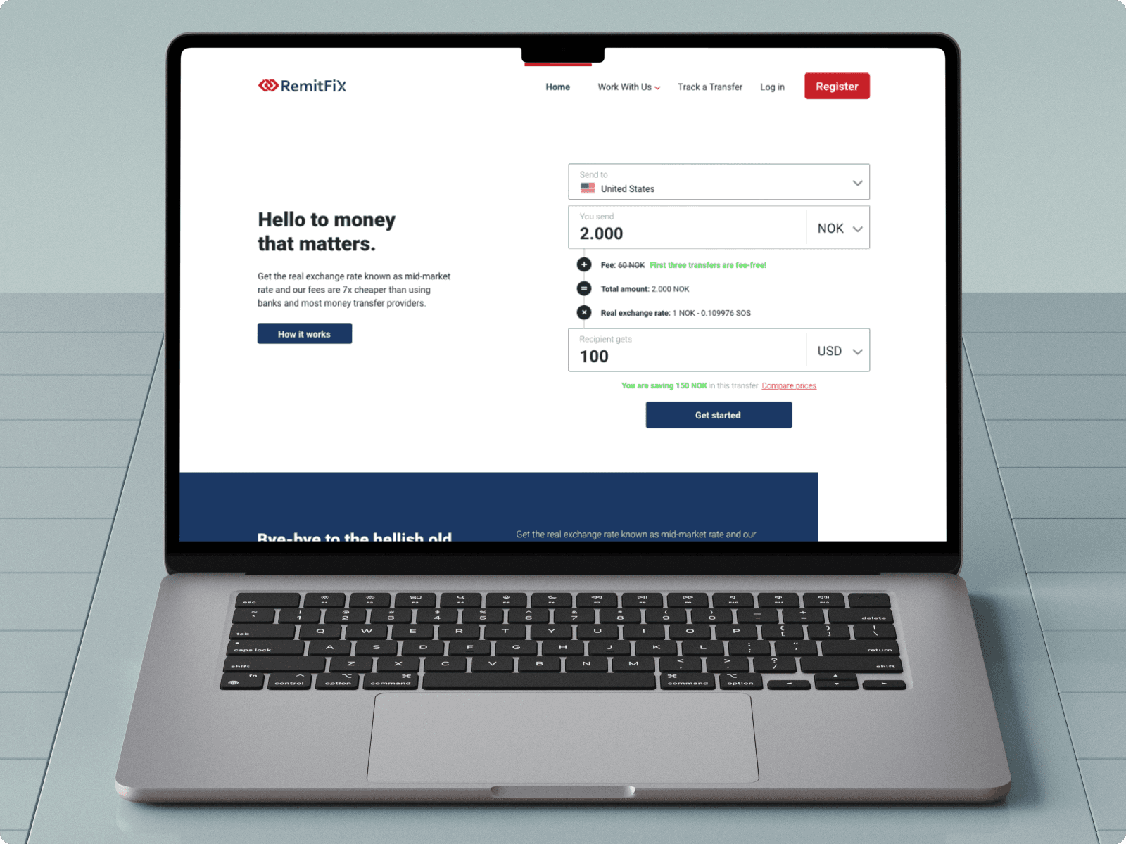
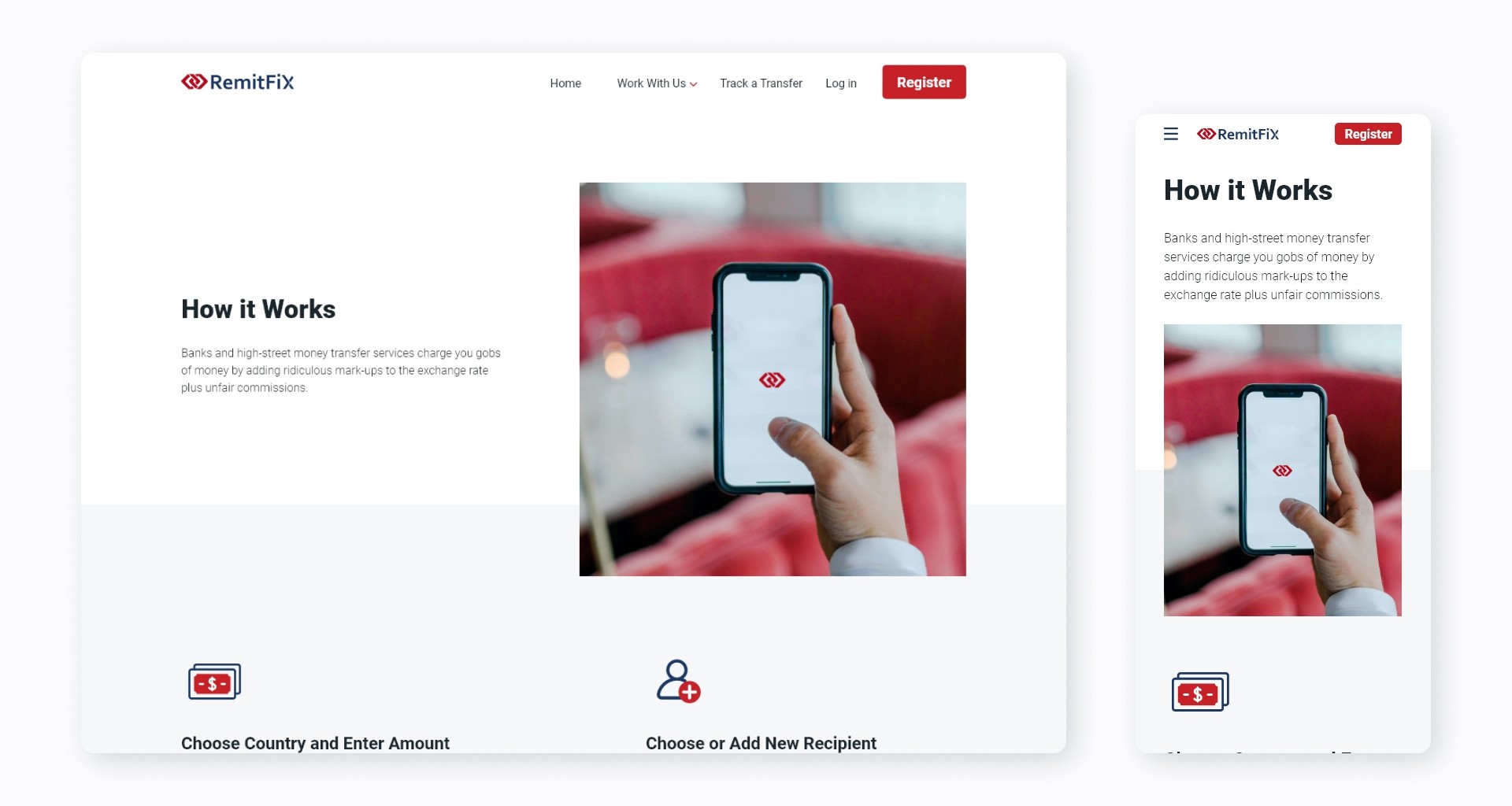
Mobile Interface and Responsiveness
Building a responsive website was a must, so this was the last step in constructing the web experience. It was an important step since our users had shared that they sometimes use services like this from their phone when they are on the go. While desktops have advantages such as larger screens, mobile devices provide flexibility and portability for users. This makes it easier to send money quickly since mobile devices offer a more real-time experience.
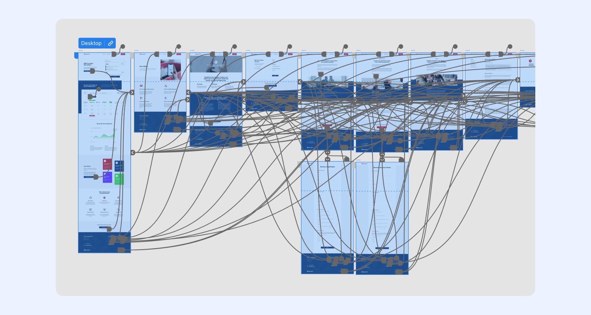
Prototype
After completing the research and design phases, it was time to bring the web experience to life.
While my main tool is Figma, I used Adobe XD for this project because it was the primary tool used by the platform's designers. Using a tool I was already familiar with made the process easier and faster. I represented the experience as closely as possible to the final design in terms of UI components, which allowed me to examine usability issues in detail and address them.
Conclusion
This project was a fun and rewarding experience for me. It allowed me to solve problems for users who are similar to me (as I am also an expat) and address some of my own pain points. This proved to be an exercise in empathizing with the user, and also taught me the importance of listening to feedback, even when I thought I knew the experience. This helps to improve the design and user experience.