Dating app during the covid pandemic

Role and timeline
• Product Designer & researcher • August 2020 - December 2020
Methods or tools
User journey mapping / Competitor analysis / Design audit / Visual design / Prototyping / Testing
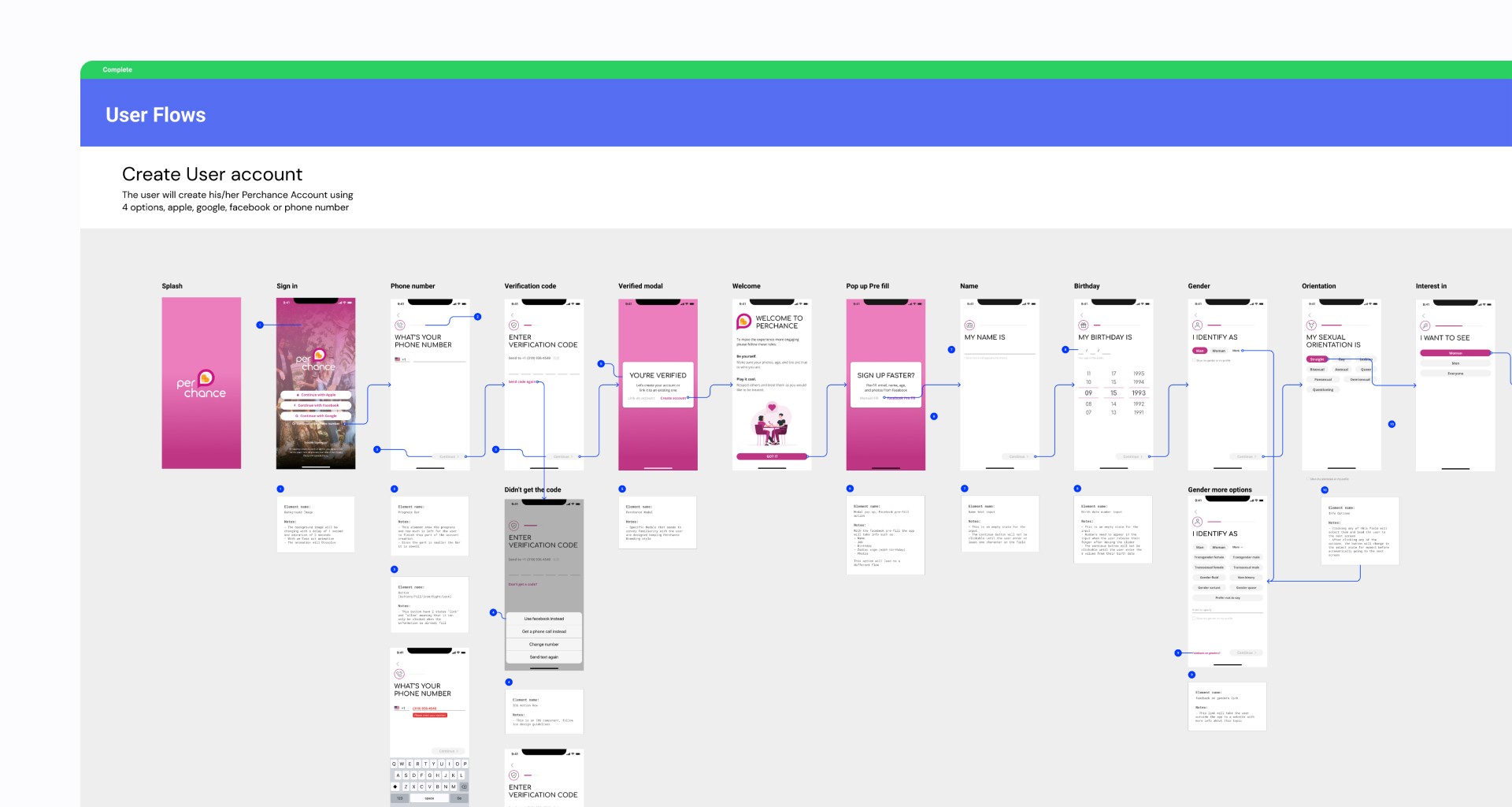
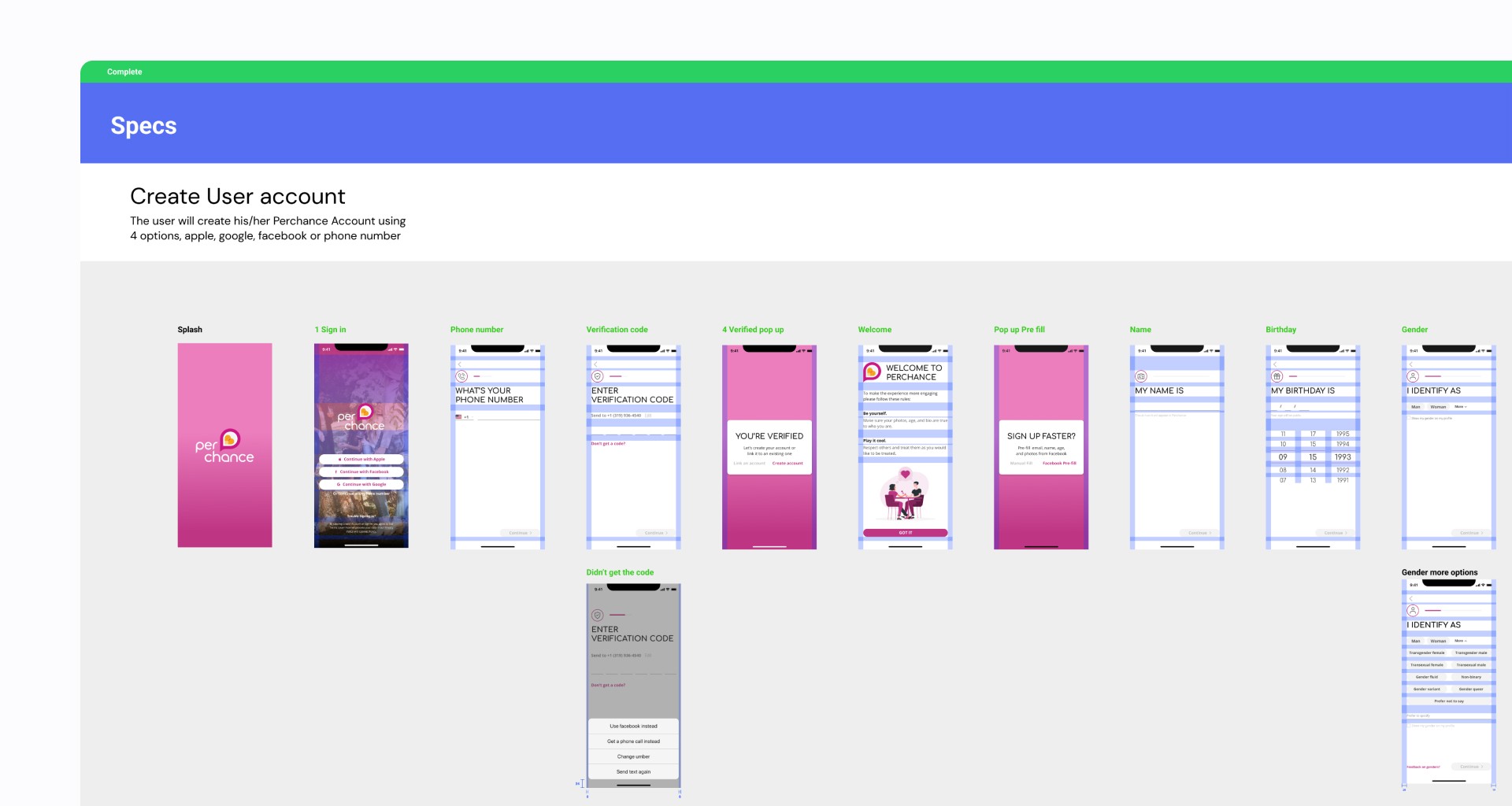
I led the product design process for a 5-month project to redesign the dating app experience on Perchance. Our goal was to give the app a modern look in line with competitors' standards, while also ideating and implementing features that would help users make connections during the COVID-19 pandemic.
The Challenge
Perchance is a startup that aims to revolutionise the way people find significant others. Its mission is to show that dating is more than just swiping right or left. Perchance allows users to connect with singles in their area and encourages them to go on a date.
As part of a team formed to bridge the gap with our competitors, I led the design process to improve the visual appeal of the dating app.
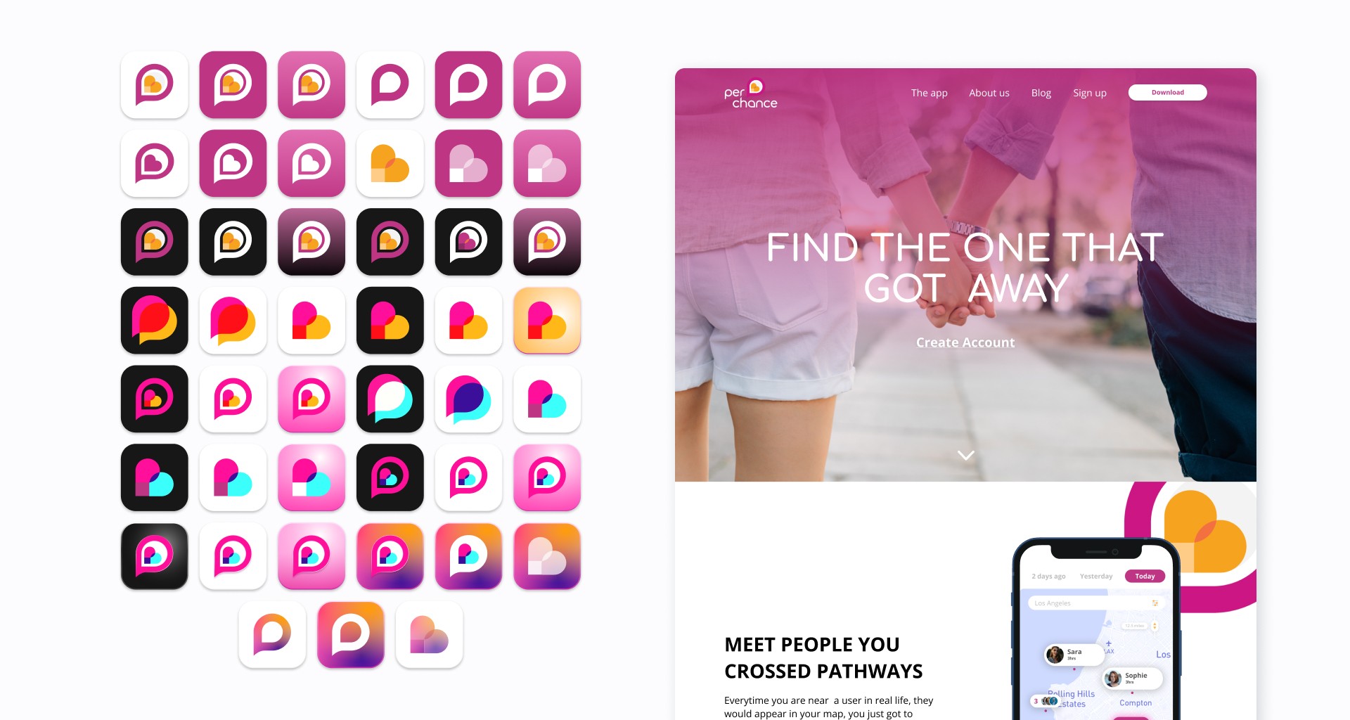
Initially, Perchance's user interface looked outdated, resembling one of the first apps on the App Store that had never been updated. Moreover, users from dating apps were having difficulties connecting with people due to the pandemic.
As a result of these limitations, users would attempt to download the app, see its outdated appearance, and immediately uninstall it and move to a different competitor. Our design questions were: ‘How might we make Perchance’s users perceive the app as modern?’ and ‘How might we help Perchance’s users make meaningful connections?’
Previous screens
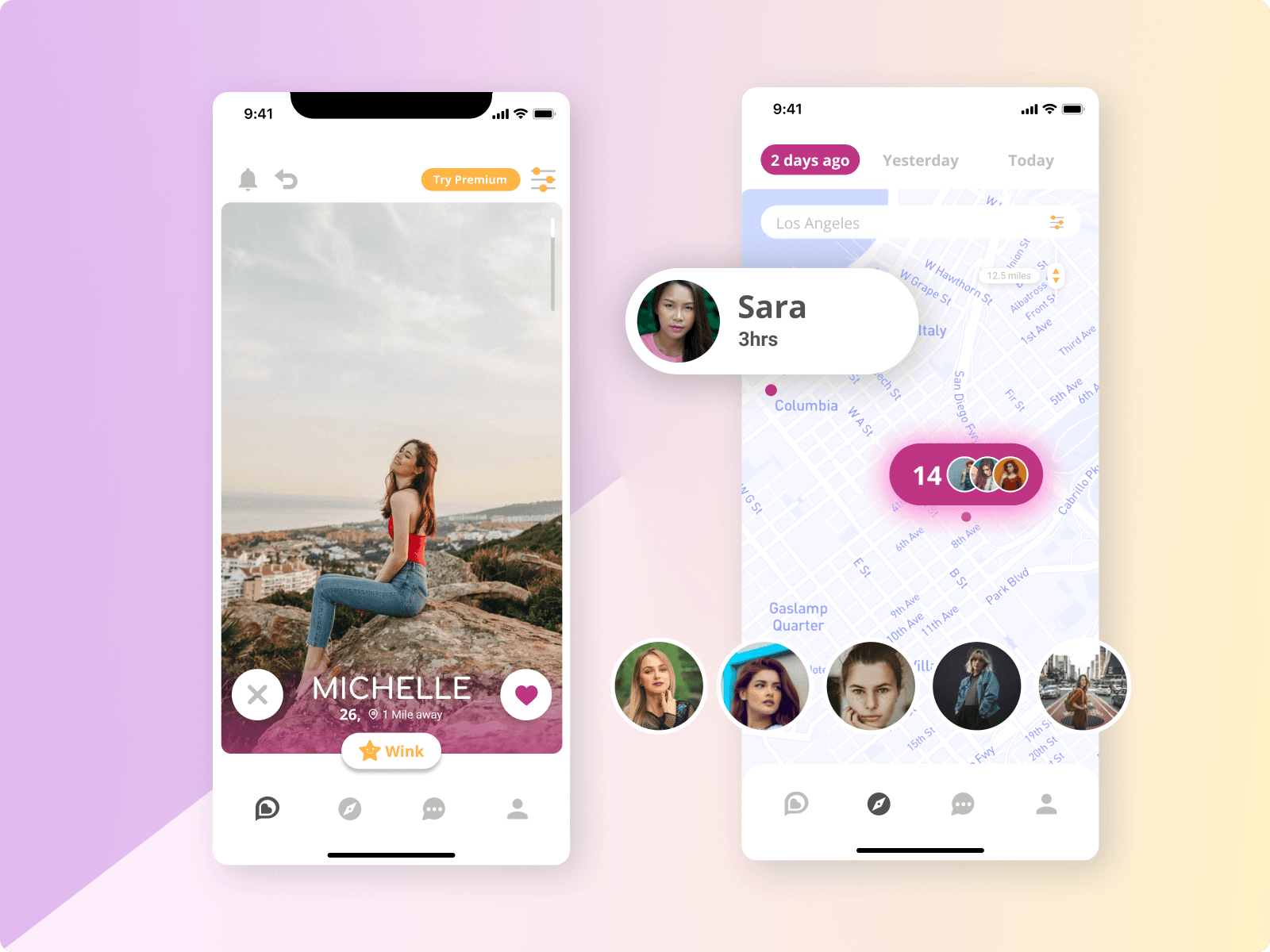
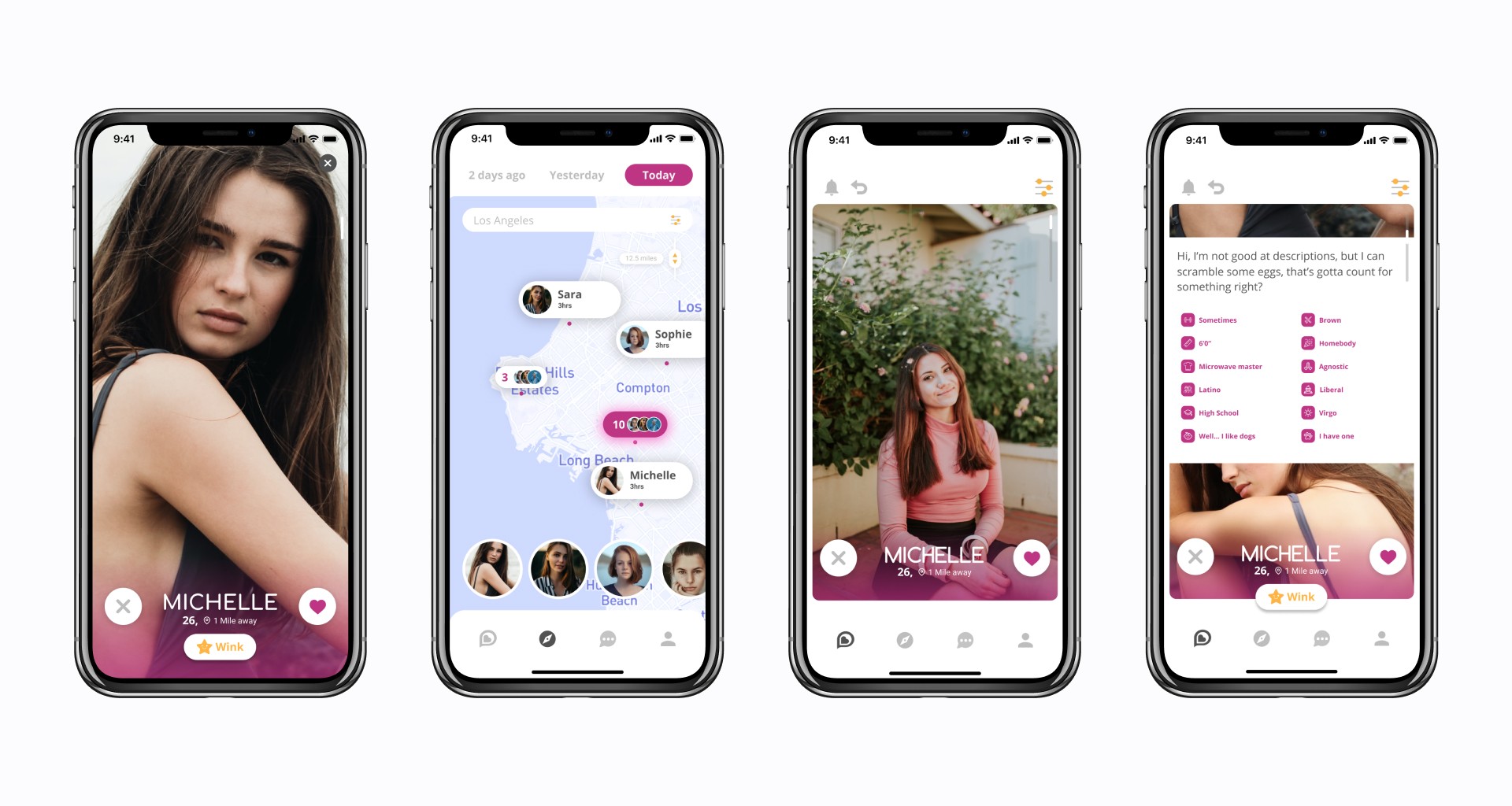
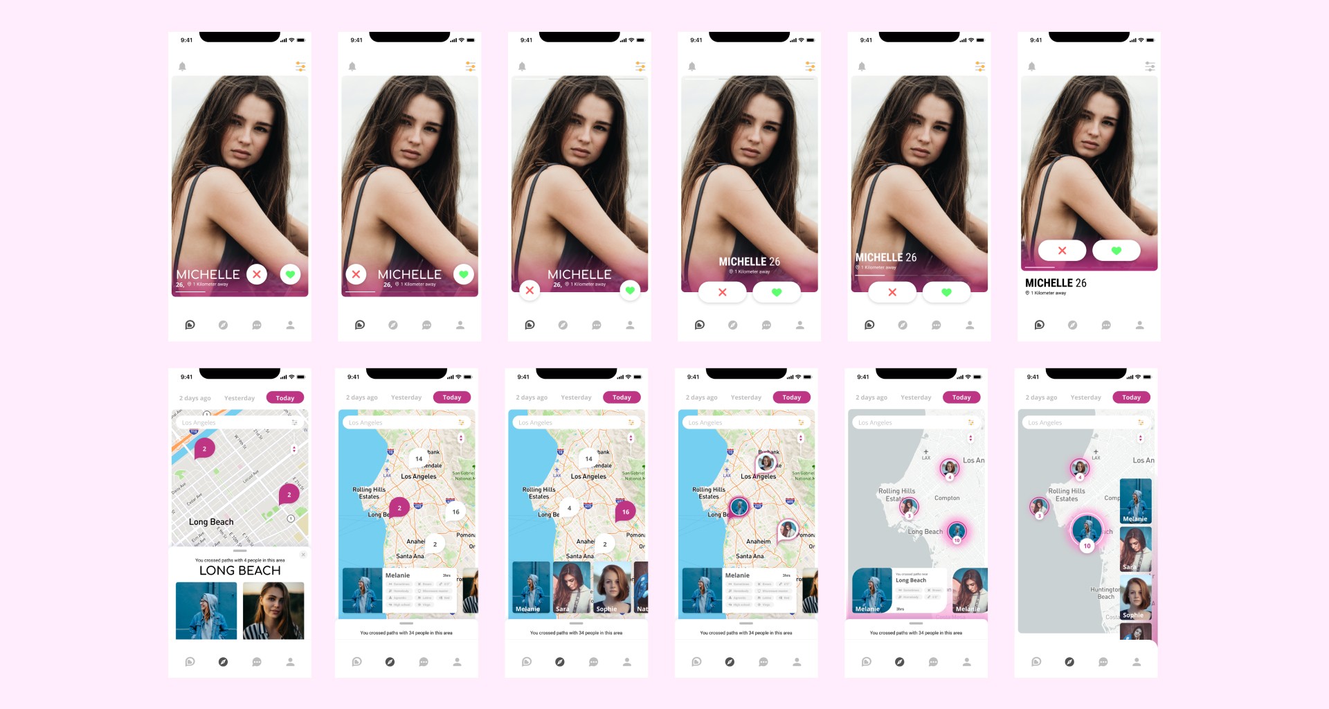
New Designs
Defining the problem
Analysing our Users
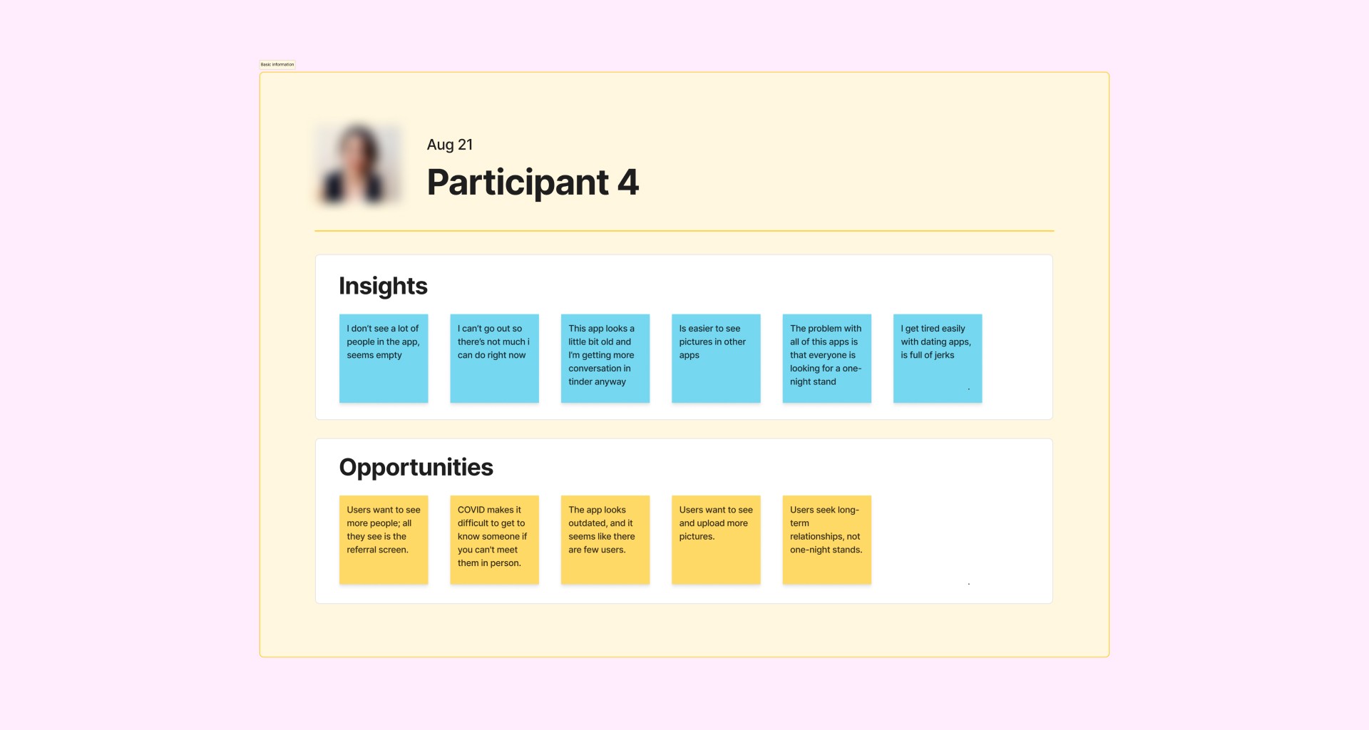
To gain a better understanding of our users' needs, pain points, and opportunities for improvement, we conducted interviews with close friends and family members who were single and had used dating apps. Despite reviewing previous feedback via app store reviews and consulting with Customer Success Managers, we received few responses. Ultimately, we conducted 10 interviews.
From these interviews, we identified several opportunities:
Users want to see more people; they feel limited by the referral screen.
Users want to see and upload more pictures.
Users are seeking long-term relationships, not just one-night stands.
Due to COVID, it is difficult to get to know someone if you can't meet them in person.
The app looks outdated, and it appears that there are few users.
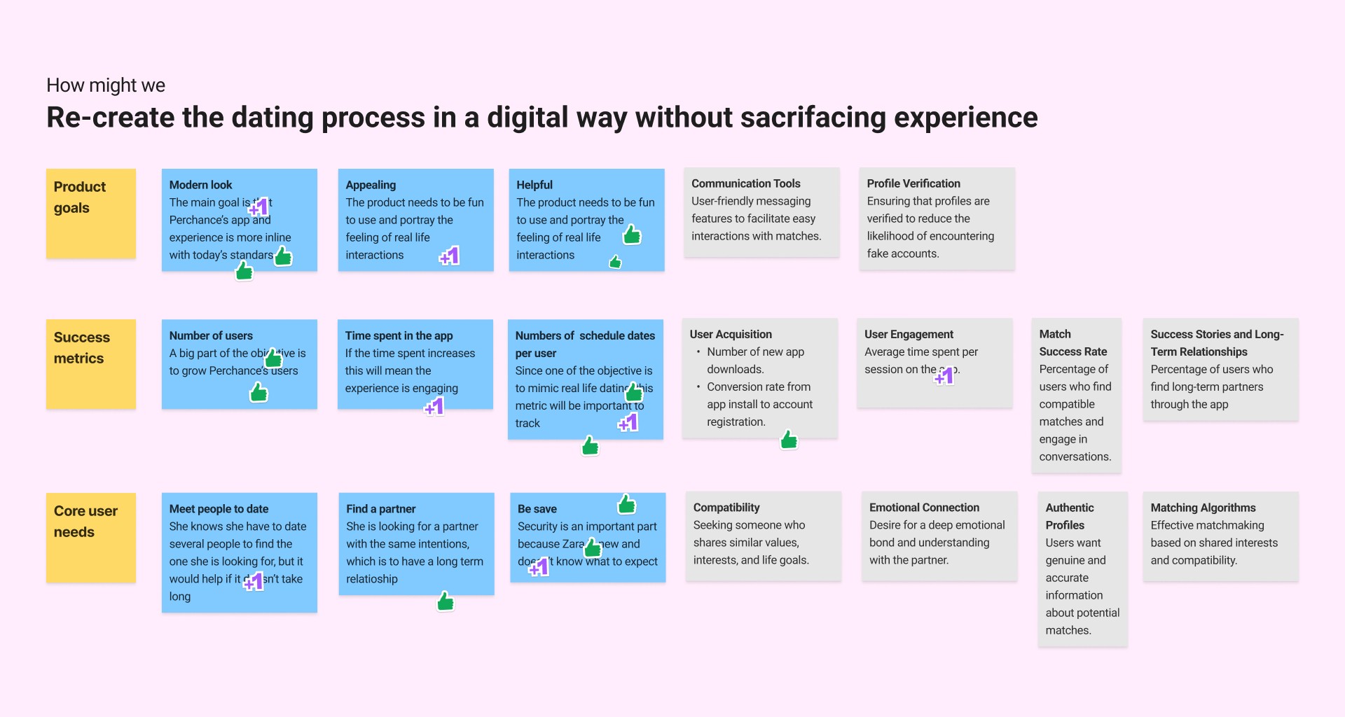
Workshop - Goal setting
To gain a better understanding of our users' needs and align our efforts, I led two workshops with the current team of four, including the CEOs of Perchance. The first workshop focused on defining our product goals and establishing measurable success metrics for the project. This helped to ensure that everyone was moving in the same direction.
The goals and metrics that we agreed upon during the workshop are:
Help users perceive Perchance's app as appealing and helpful.
Help users make meaningful connections.
Increase the number of users.
Increase the number of conversations started.
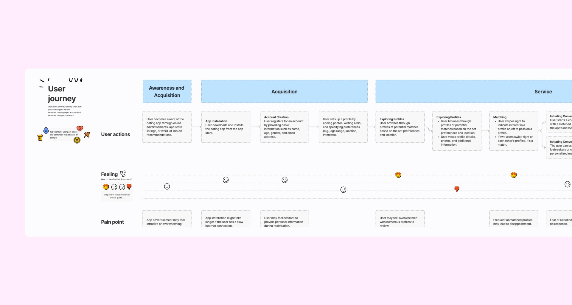
Workshop - User journey mapping
The second workshop I facilitated was a User Journey Mapping session. This session helps to visualize a user's end-to-end experience with the matches they have both in and outside of the app. It also helps to narrow a broad challenge down to a specific scope for the first iteration of the app.
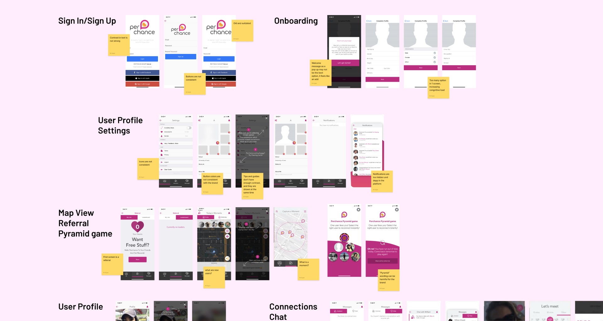
Design Audit
To streamline the main features of the app and ensure its efficiency, I conducted an audit of its current state. This involved eliminating unnecessary functions and identifying components that make the app look outdated. Through these workshops and audits, we were able to create a user journey map, improve the information architecture, and set goals for the feature ideation process.
Competitor analysis
Before designing the app, I analysed competitor dating apps to gain insights on trends, features, UI, branding, and language. This helped me identify areas where Perchance's app could improve and what features to implement for a better user experience.
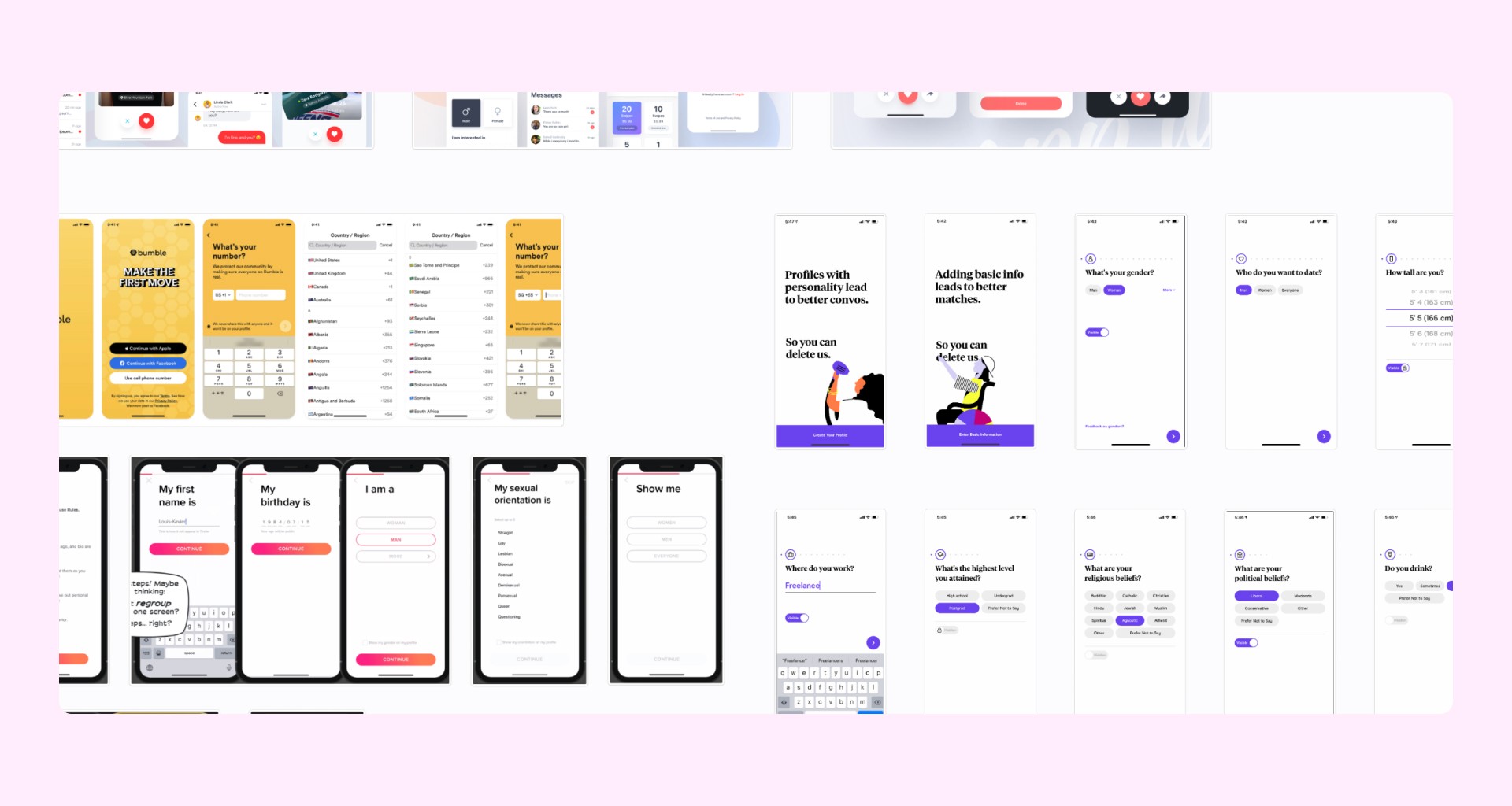
Early ideation
After establishing a solid foundation, I began designing key screens for the new app interface. These included iterations for the main matching screen and the map screen. My primary objective was to create an initial look and feel for the interface and ensure that everyone was aligned with the new aesthetic before proceeding with the rest of the screens.
Design Review & Iterate
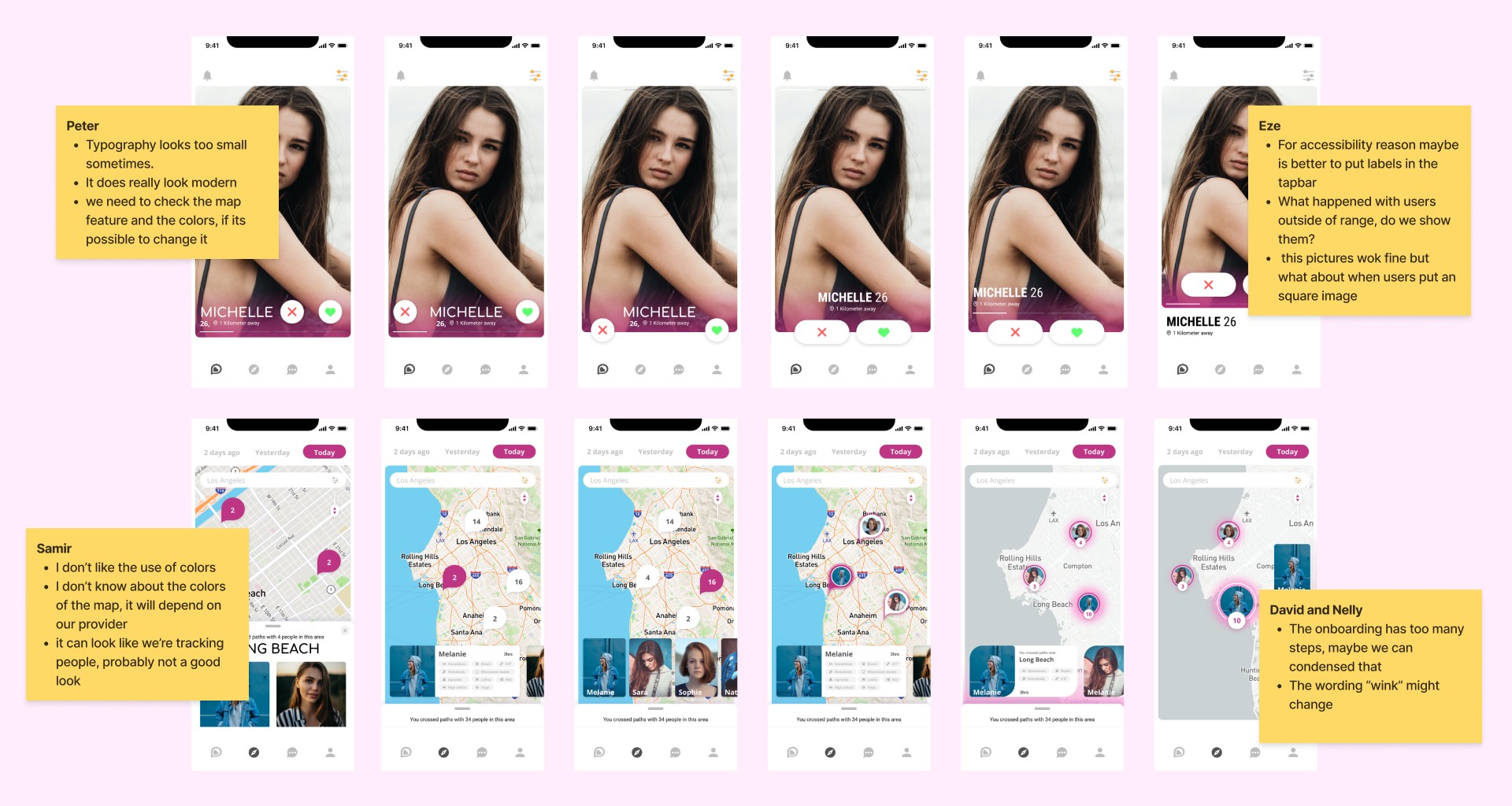
After receiving the green light on the new overall look and feel, I organized a design review with two other designers to gather feedback on the different flows and screens of the app. This review helped me gather ideas, engage in discussions, and obtain a fresh perspective on the design decisions. It also served to ensure that the design was aligned with current design standards and to kick off the next prototype stage of the project.
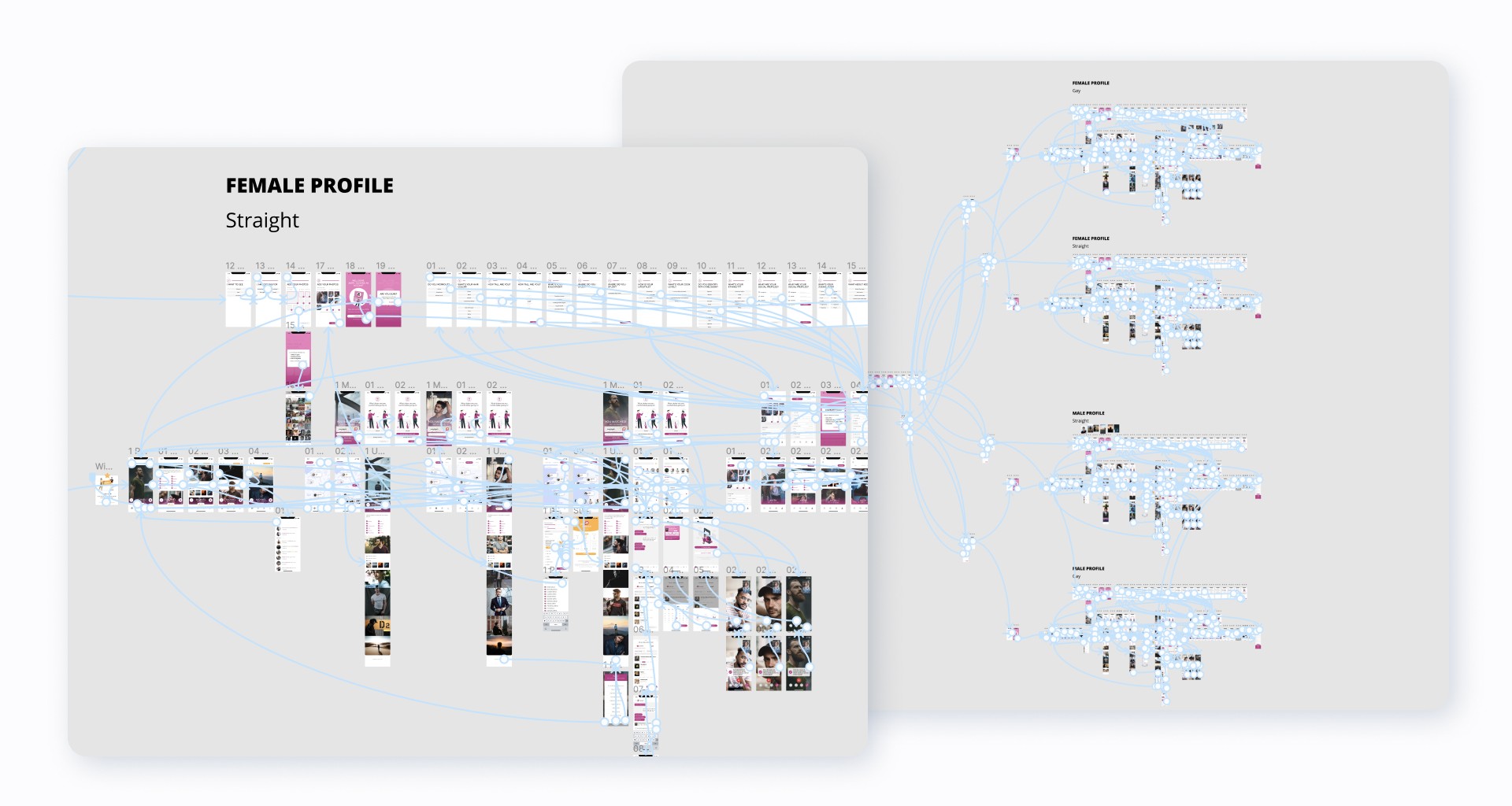
Prototyping challenge
After completing all the previous steps of the process and ensuring that everyone was on board, we had a solid foundation to start making a prototype. It was crucial to have a prototype that covered most of the important user flows as closely as possible to the future real app, in order to help Perchance's CEOs initiate conversations with investor prospects.
After many iterations, minor changes in hundreds of screens, and many hours of work, the prototype ended up covering all of the main user flows, as well as edge and minor issues. It also included 4 personas: 2 men and 2 women, both gay and straight.
Usability testing
To test usability, the previous prototype was extremely helpful. In addition, I created a testing script and scenarios to conduct a moderated usability test with internal members who were unfamiliar with the project. I also conducted three moderated usability tests with friends who had never used Perchance's app to gather feedback on how they interacted with the new product version for the first time.
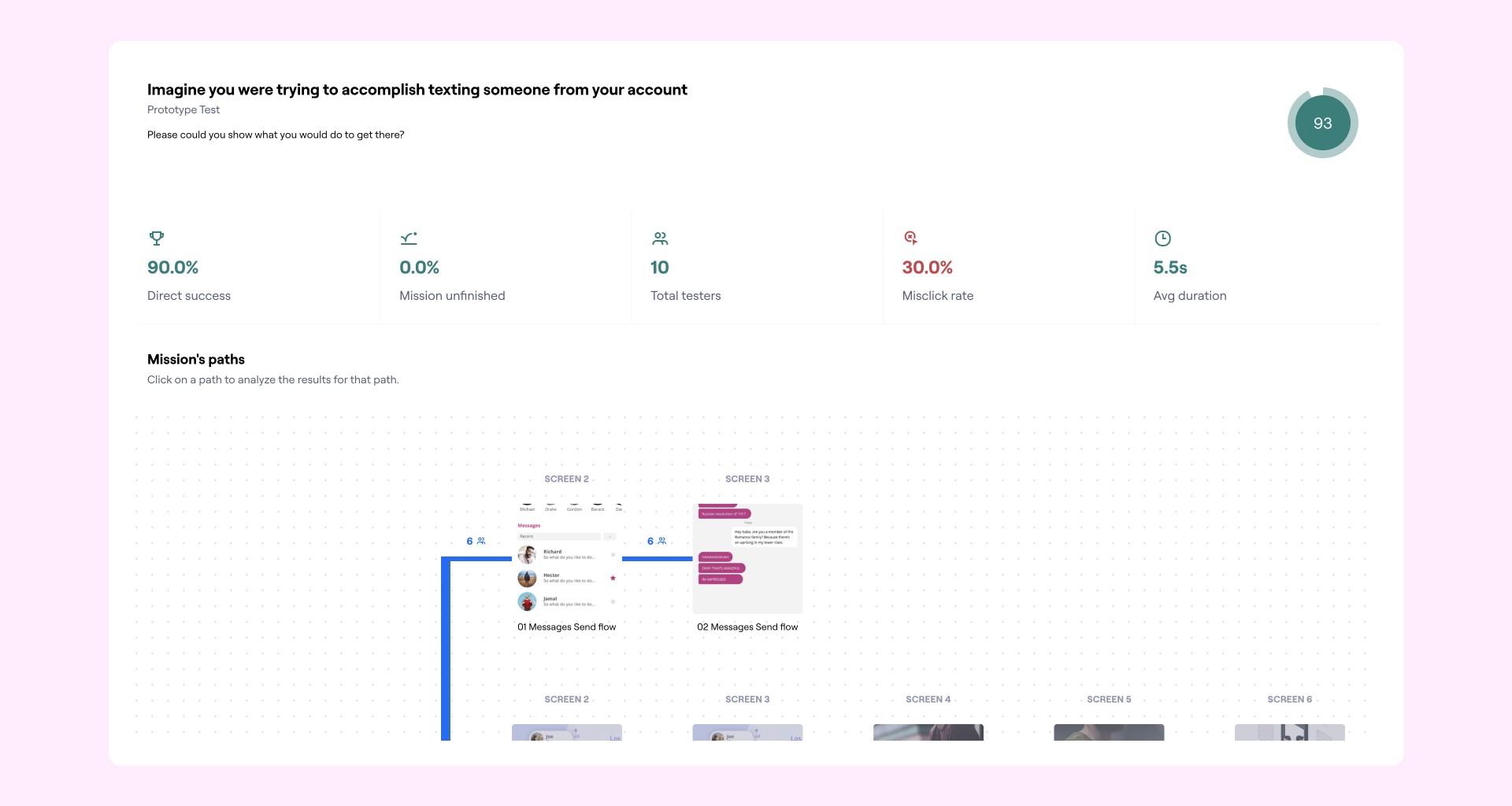
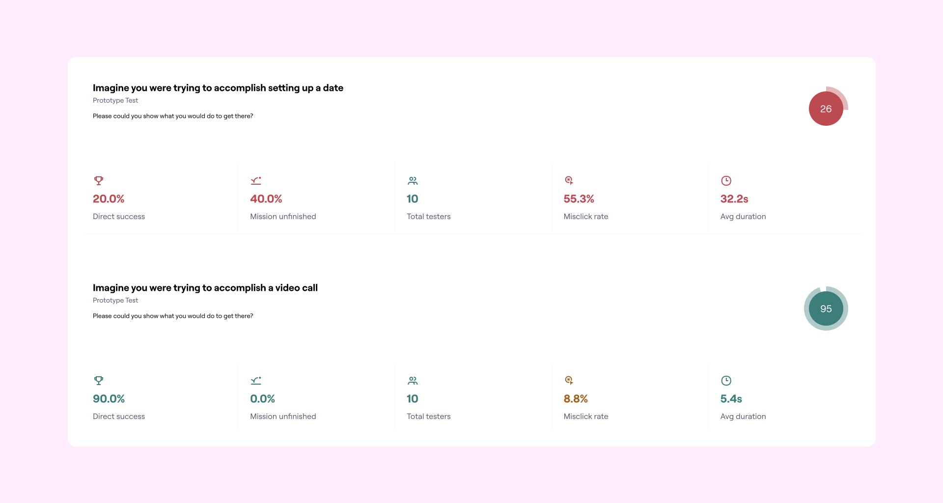
New Features
To address the main pain points of users during the pandemic, I generated various feature ideas that were not part of the initial app. The primary objective was to assist users in making meaningful connections during a time when physical interaction was severely restricted.
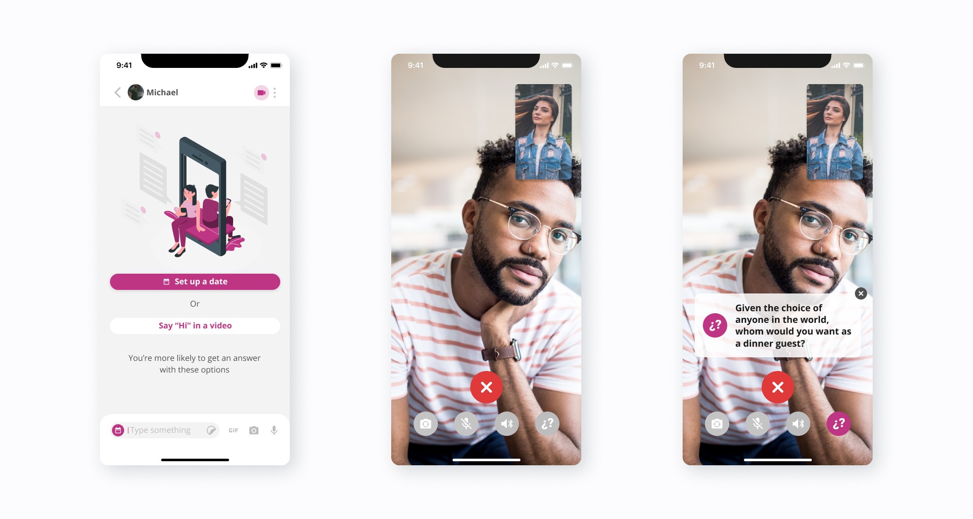
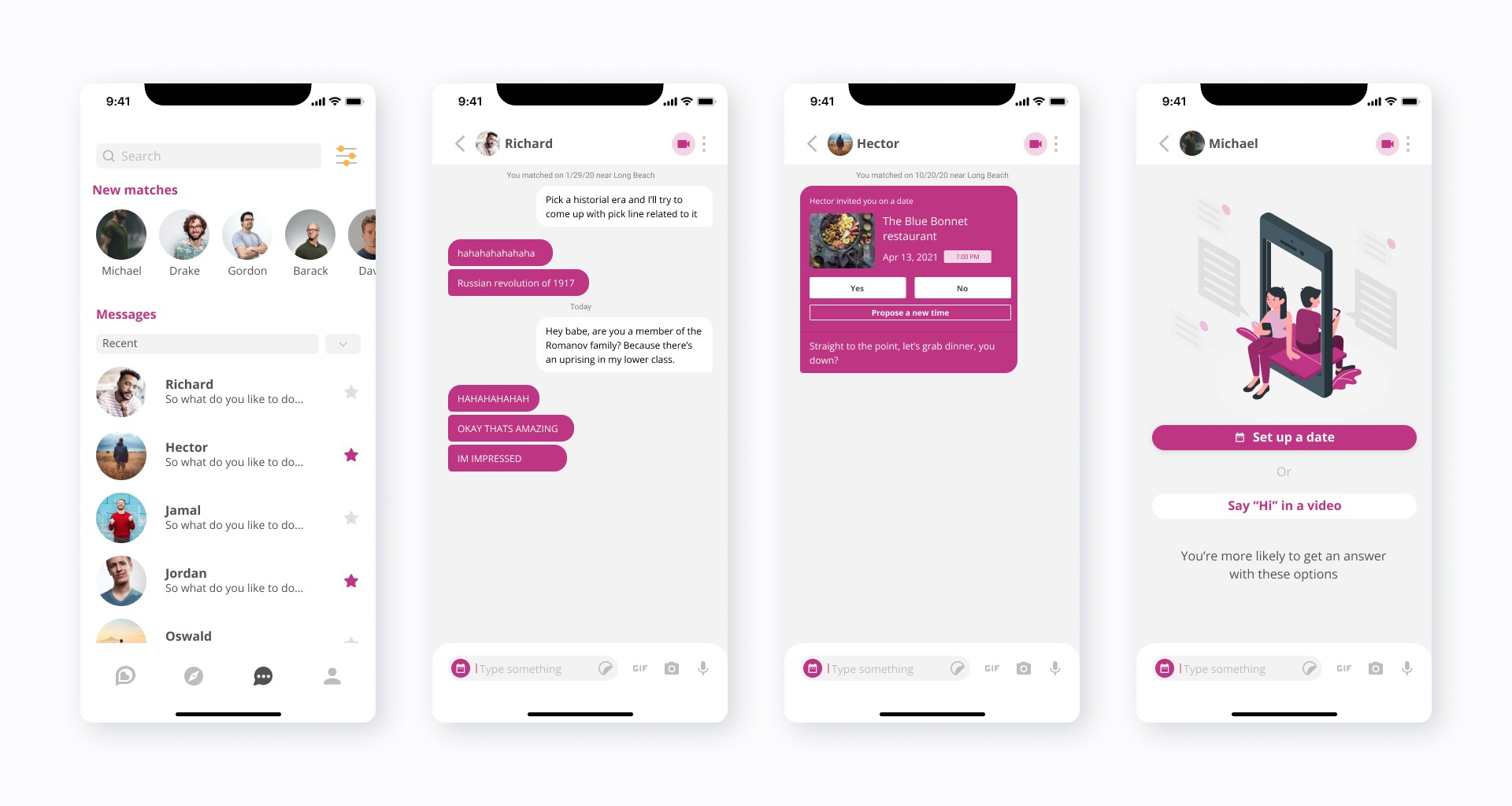
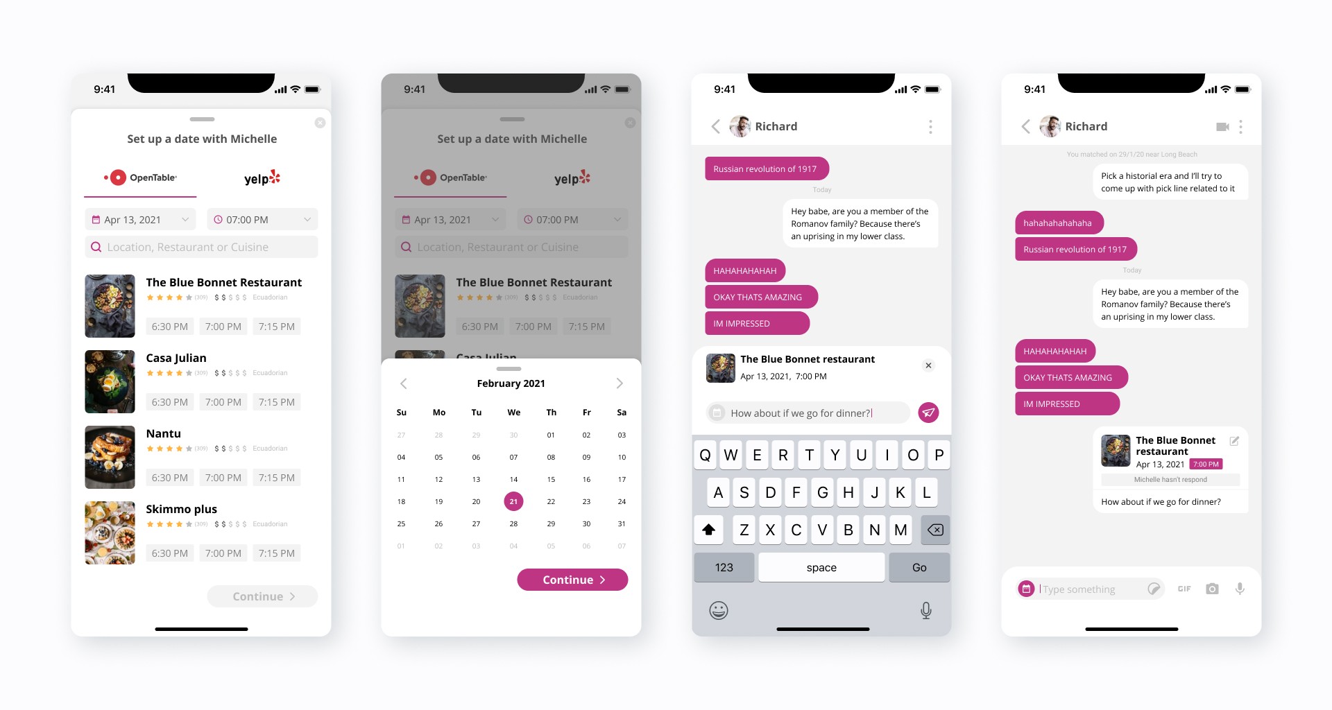
Ice Breakers Feature
The Ice Breakers feature aims to facilitate online video call dates without the awkwardness that often arises when meeting a stranger. During the research phase, I drew inspiration for this feature from a New York Times article entitled “36 Questions That Lead to Love” based on a study by psychologist Dr. Arthur Aron, which aimed to accelerate the creation of intimacy between two strangers. Essentially, I translated that experience to the Perchance app.
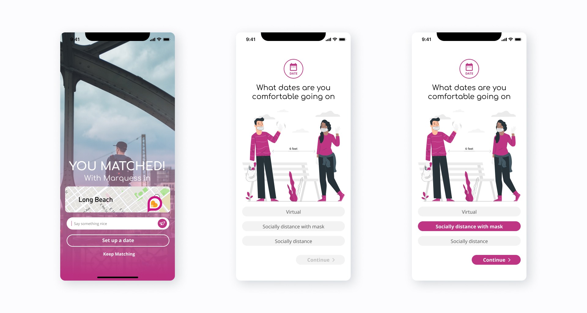
Covid dates
In the United States, where most of Perchance's users reside, some areas have lifted public restrictions for civilians, and people are starting to go out again with precautions. This inspired the idea of allowing users to set up dates within the app with the conditions they feel most comfortable with.
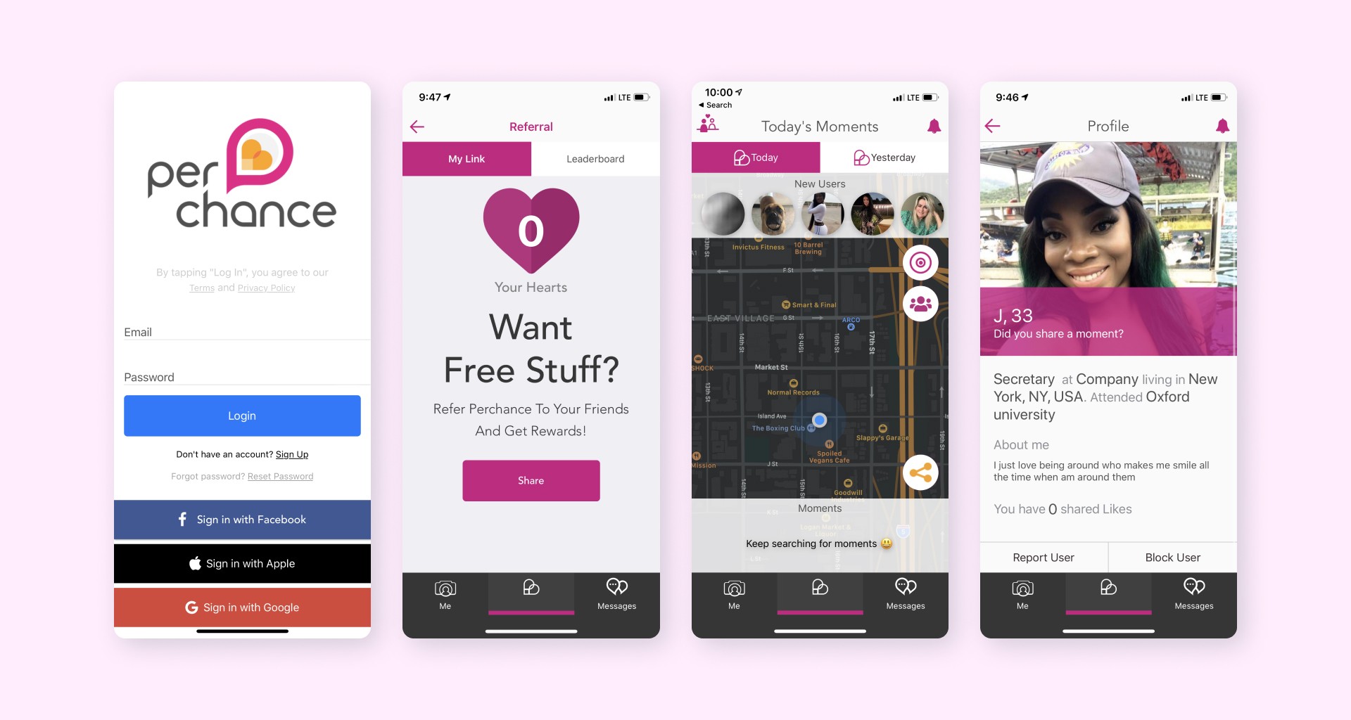
User interface components
Branding and app icon
I designed and iterated at least 50 app icons for the new application. Additionally, I created the initial mockup for the new website, incorporating the new tone and language.
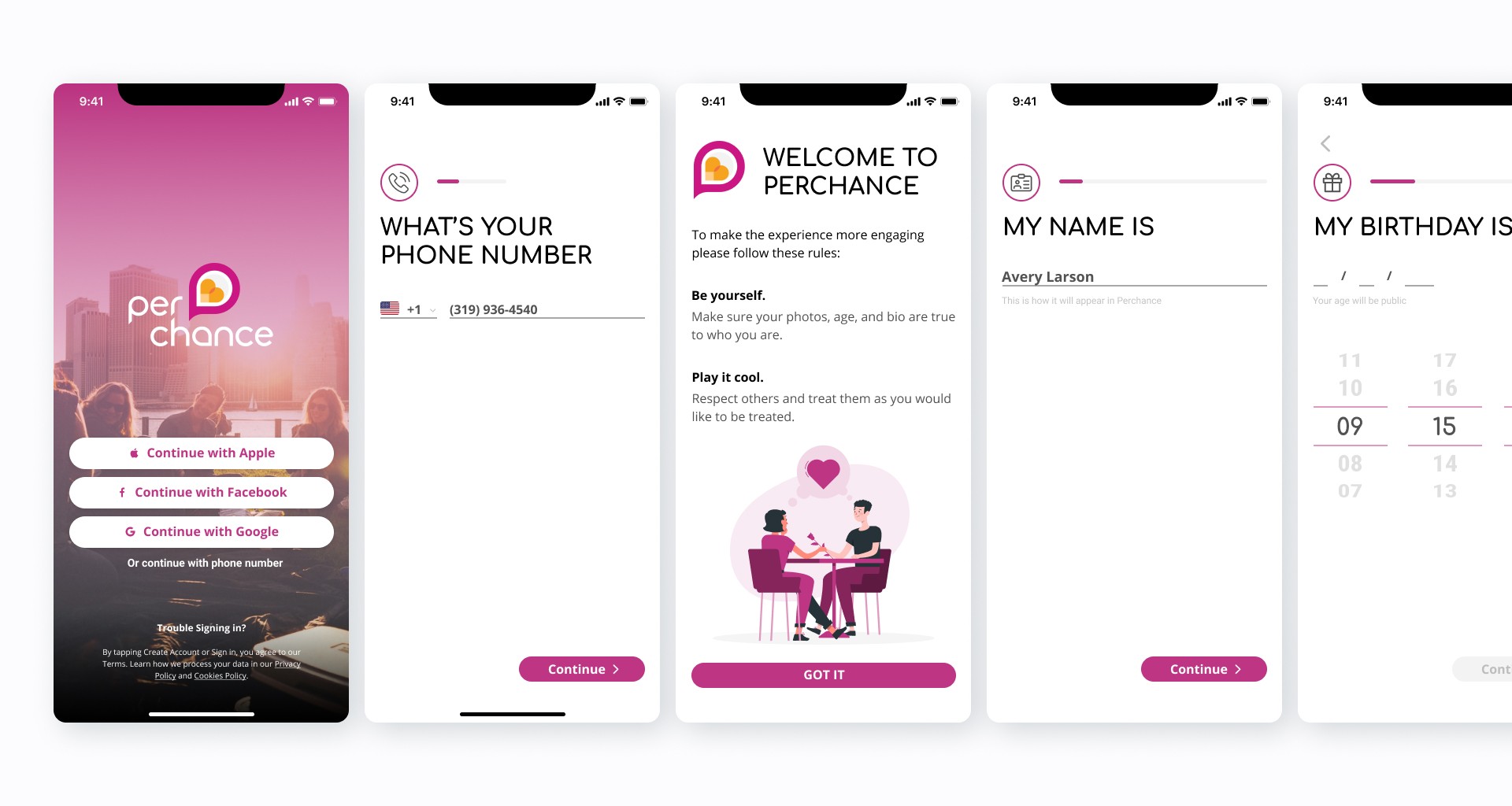
Onboarding
Messages
Illustrations
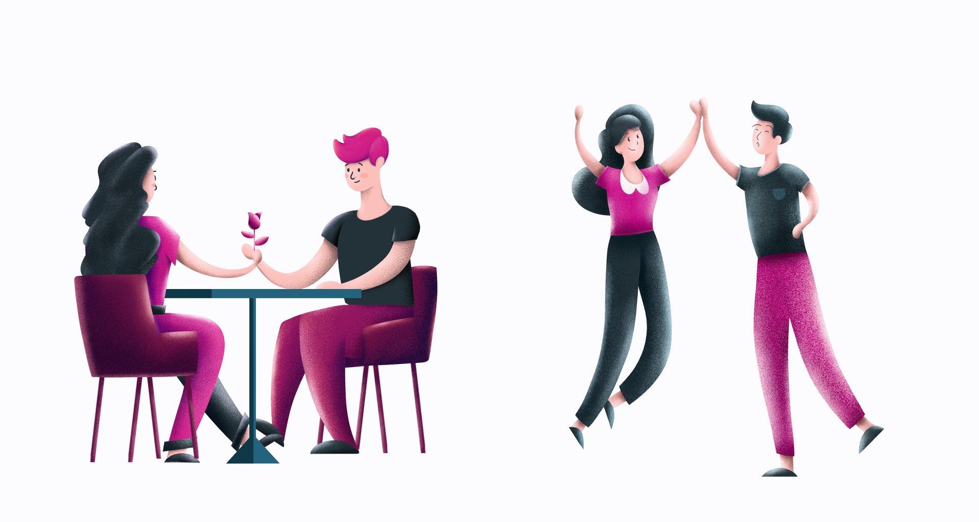
I have set the style for the illustrations in the app.
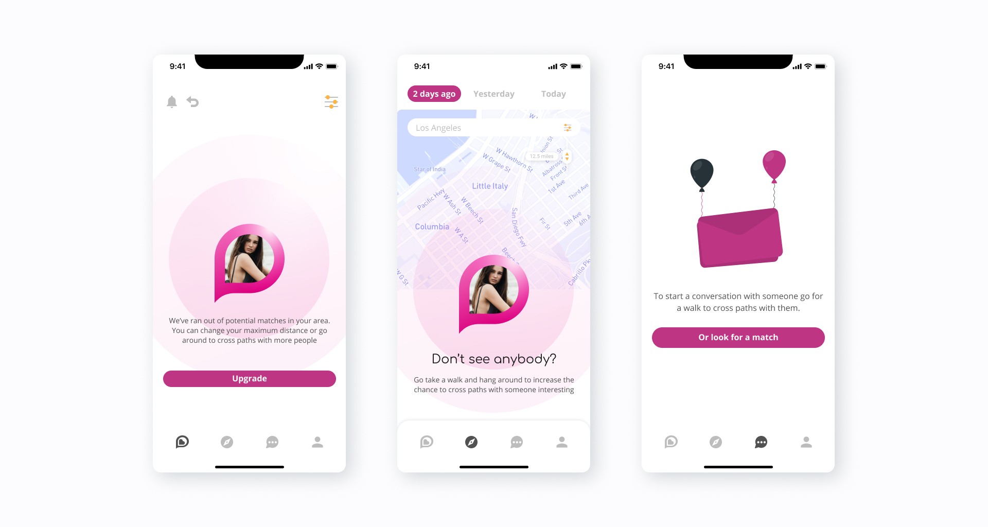
Empty states
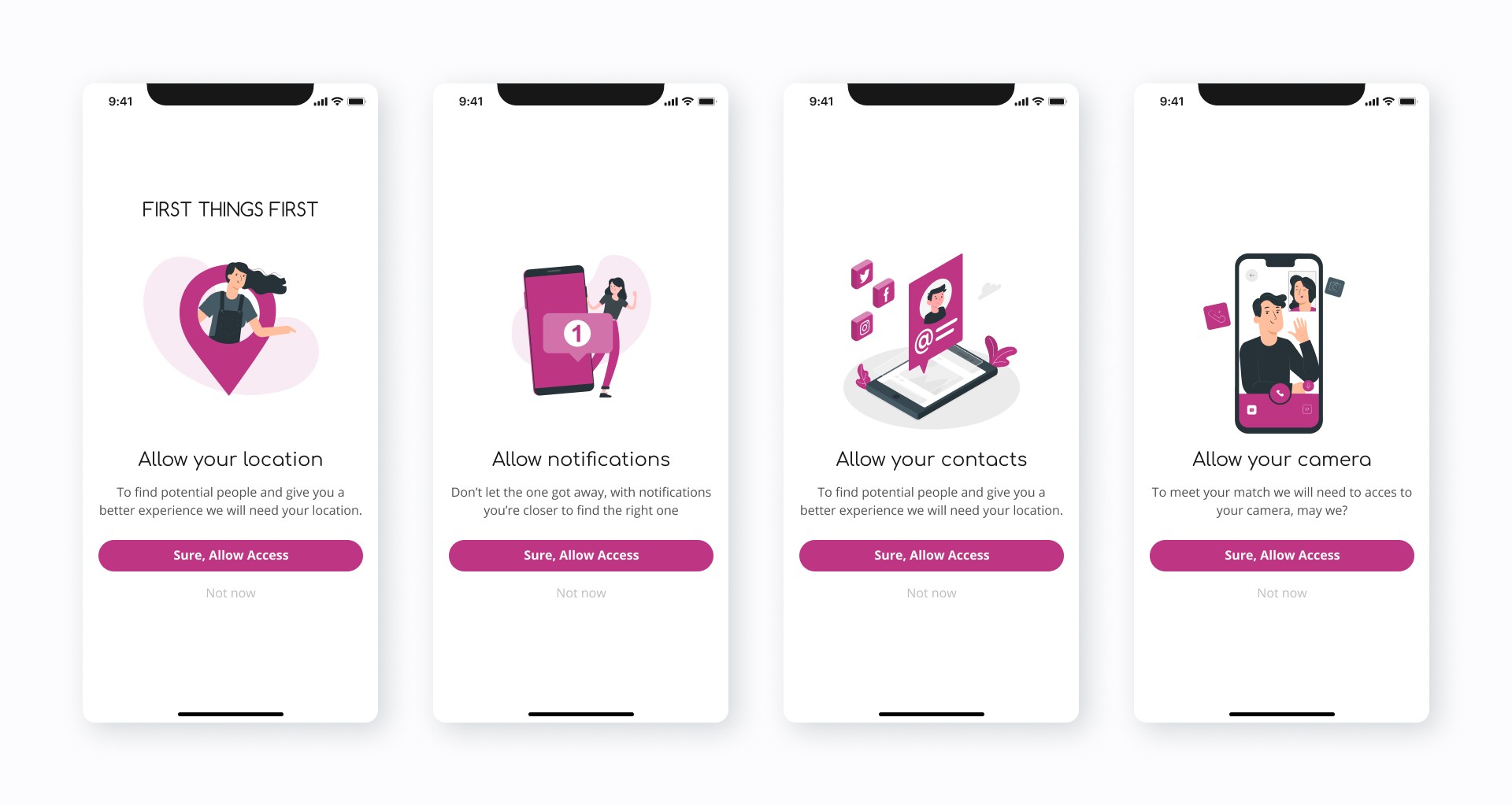
Permissions screens
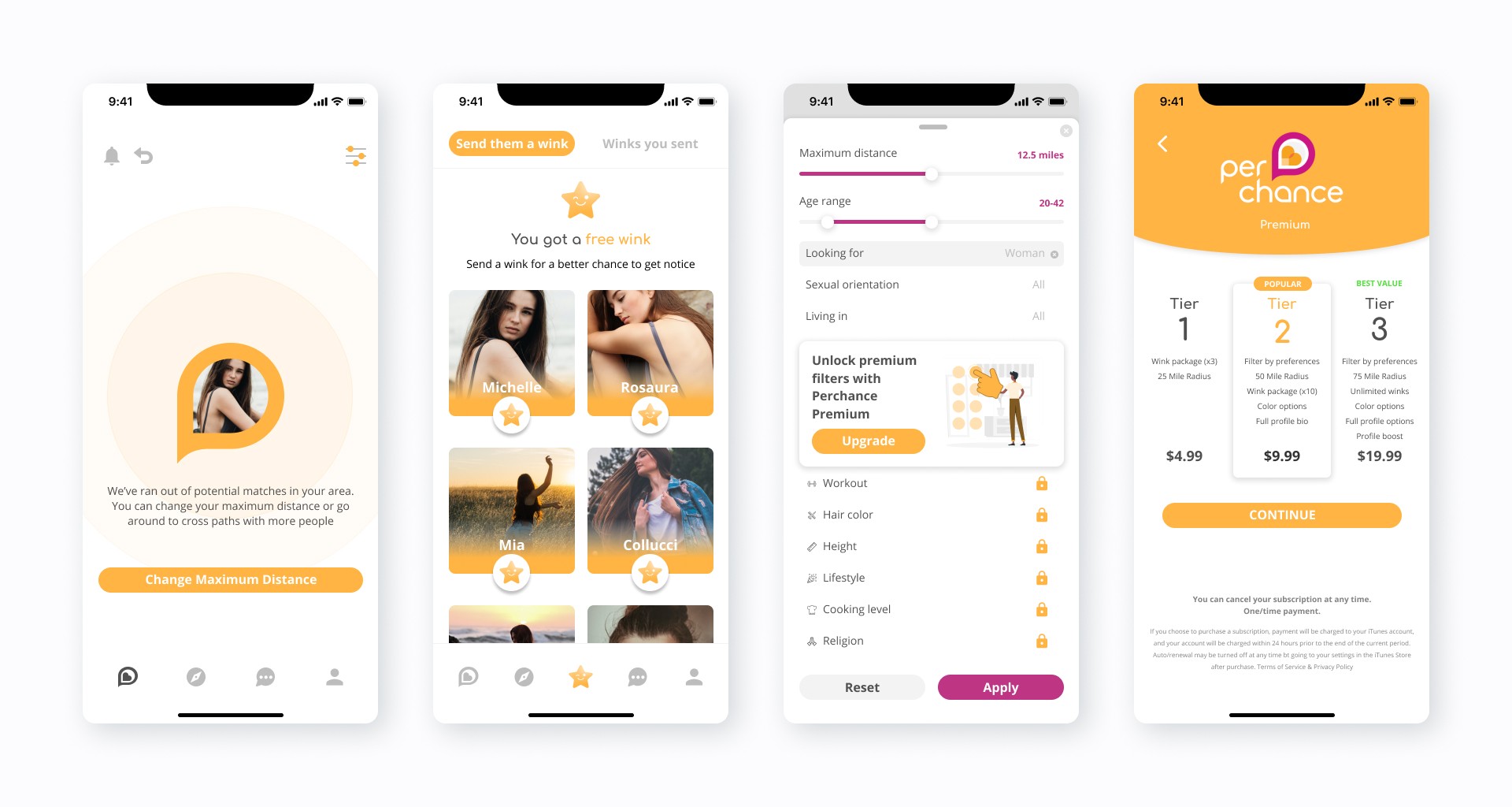
Premium features and branding
Further steps
After designing and preparing necessary files for the dating app, the next steps are development and implementation. The design files are handed over to the development team to create a fully functional app. Tasks to be completed after the design is ready:
Collaboration between design and development teams is essential during this phase.
The development team will test, debug, and optimize the app for various devices and systems.
Product managers and stakeholders will work on launch strategies, marketing plans, and user acquisition campaigns.
Legal and compliance teams may also review the app.
Once the app is ready, it will undergo thorough testing before launching on app stores.
The team will continue to gather feedback and enhance the app's features.
Conclusions
My work on the redesign of the Perchance app allowed me to utilize my product design skills to identify and resolve issues, resulting in an intuitive and user-centric experience that enabled Perchance's CEOs to attract investors, improve the overall perception of the app, and ultimately help users find and build meaningful connections. Although I was unable to continue working on the project, I am confident that my efforts have laid the groundwork for future development and highlighted the key areas for improvement.